Project overview
Background
Tyler Technologies' Open Data Platform is used widely across local and state governments to enable users to “use easy-to-interpret, cloud-hosted data to tell stories and connect with [their] communities.” Data publishers on the Open Data Platform can create data stories where they can embed data visualizations and tell a story about their data.
Problem
There is no mechanism on the Open Data Platform to check for accessibility issues in data stories, and the data story tool relies on the users developing the data story to ensure that their content is accessible. Not all users are aware of accessibility best practices– this lack of accessibility support leads to the creation of data stories that are not accessible.
Goal
To add a feature to the data story tool that allows users to check for accessibility issues and resolve them.
Solution
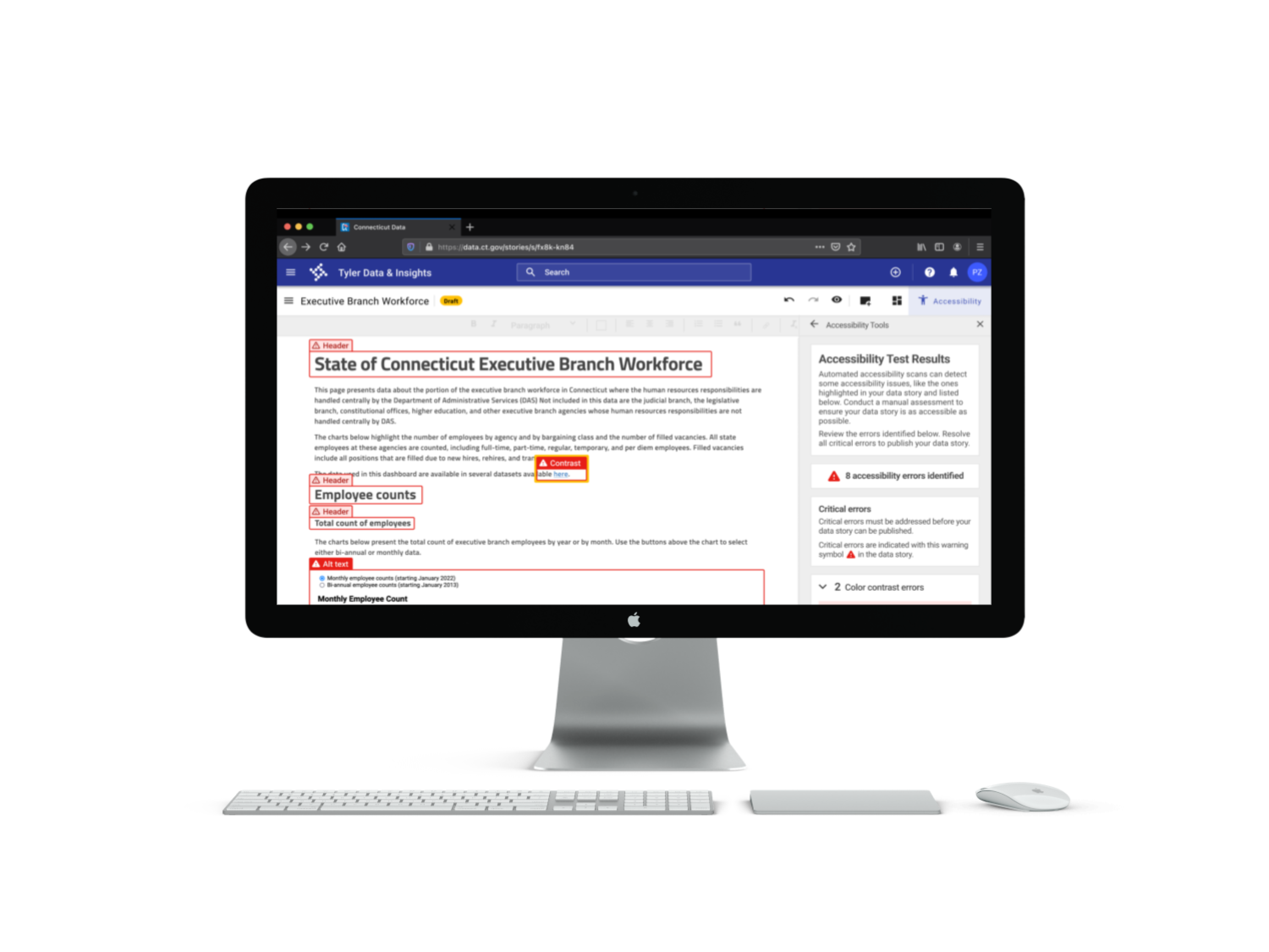
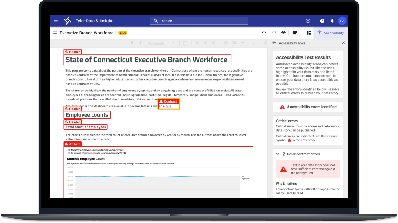
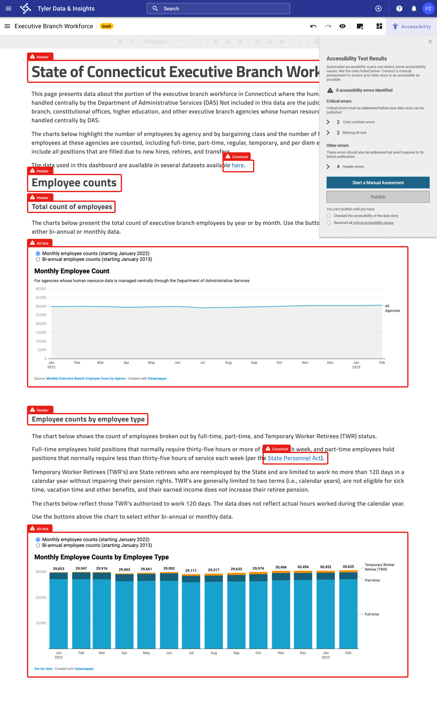
I created a conceptual design for new feature for Tyler Technologies' Open Data Platform– an accessibility checker for data stories that allows users to run an automated accessibility scan, conduct manual accessibility testing, and resolve accessibility issues in their data stories before publishing their data story.
Timeline
February - March 2023
My role
End-to-end UX/UI designer. Responsible for user research, prototyping, and testing
Tools used
Figma, Miro, Axe DevTools, Chartability
Design process
Empathize
Research the needs of users and understand their needs, goals, and pain points
Empathize
User interviews
I interviewed five users of the data story tool to understand their current practices, needs, and challenges in making their content accessible. The takeaways from the interviews are summarized below.
Current practices
- No user had a formal process for checking data stories for accessibility.
- Some users had mental checklists for specific issues (ie colorblind safe color palettes, accessible fonts, general clarity, etc.)
Challenges
- The biggest challenge identified was that people developing data stories aren’t aware of accessibility issues with web content or data visualizations.
- Another challenge was the lack of clear standards and requirements for data story accessibility.
- Data visualization tools used to create content for data stories can also be limiting in terms of how accessible their products are.
Desired features in an accessibility checker
- All users were interested in the concept of an accessibility checker for data stories.
- Users wanted to see a checklist of accessibility issues to ensure a comprehensive review of accessibility issues.
- Users thought an accessibility checker should require that at least some standards be met before the data story could be made public.
User personas
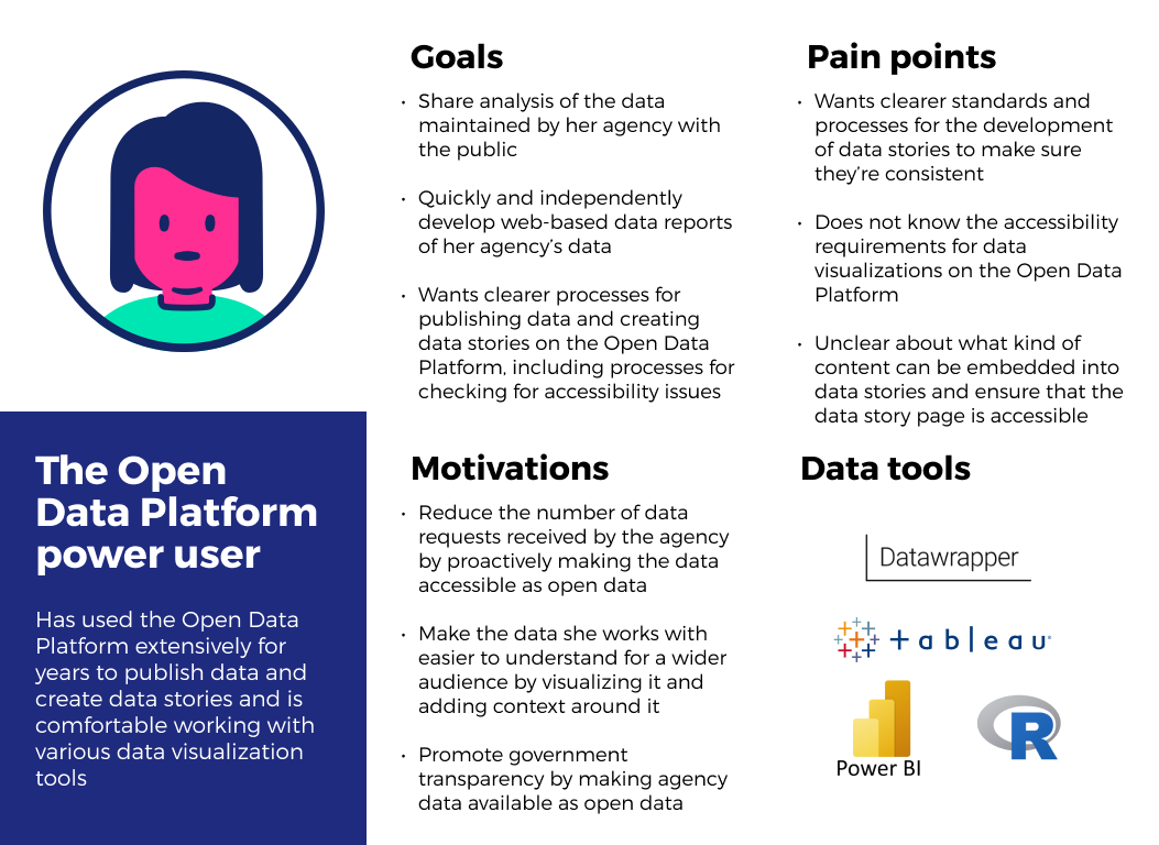
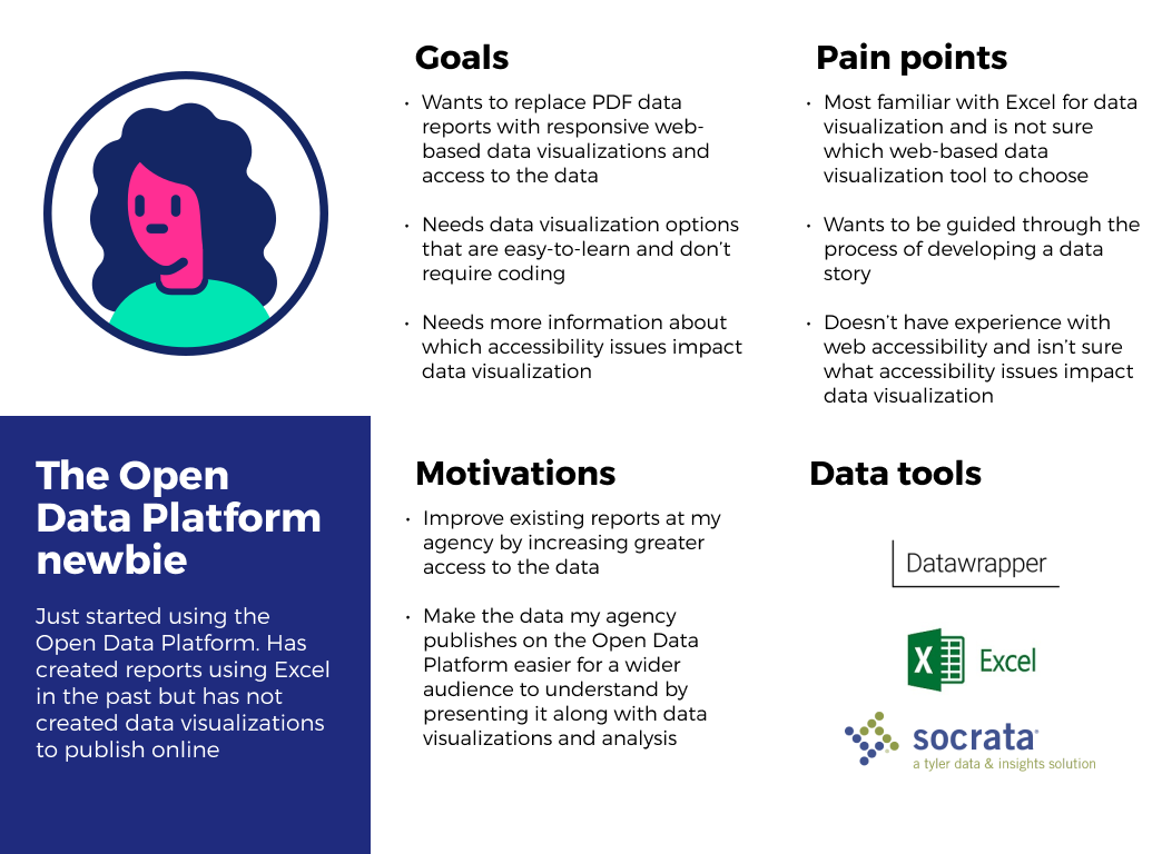
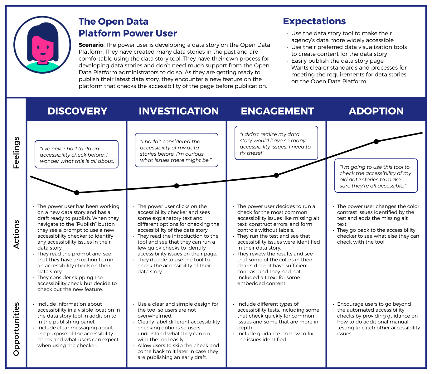
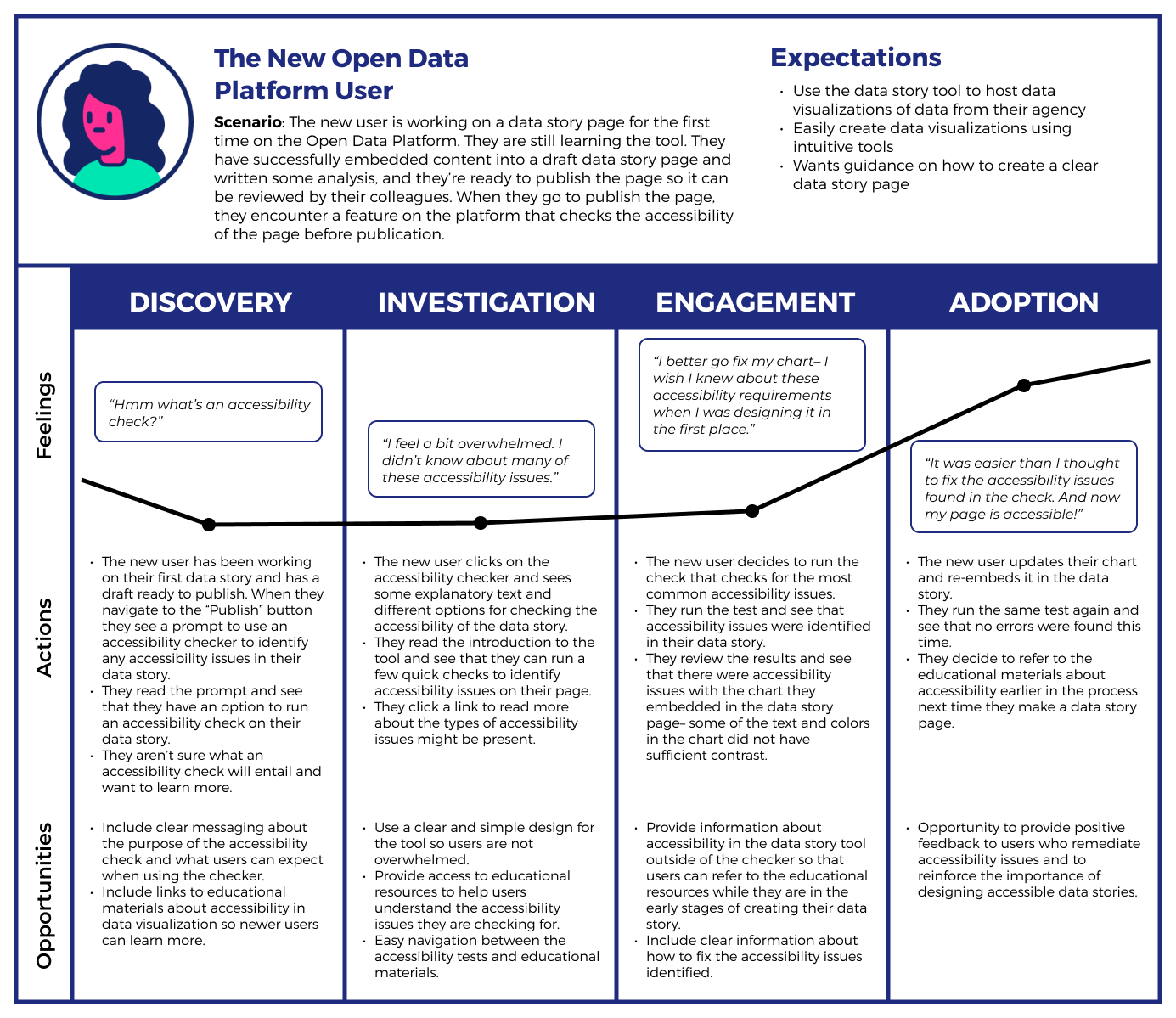
Based on the interview findings, I developed two user personas: the experienced Open Data Platform user and the new, less experienced user.
User journey maps
The journey maps below illustrate the experience of the new and experienced users when they encounter the accessibility checker. These maps focus on how users can integrate the accessibility checker into their process of developing a data story on the Open Data Platform.
Define
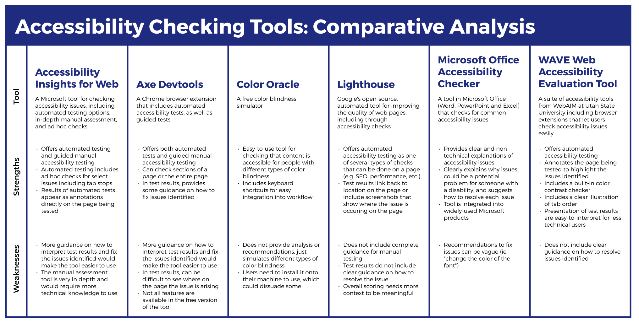
Comparative analysis
As part of my research, I reviewed tools that allow users to check the accessibility of their content, including: Axe DevTools, Lighthouse, Color Oracle, Accessibility Insights for Web, WAVE Web Accessibility Evaluation Took, and the Microsoft Office Accessibility Checker.
Takeaways
Based on my analysis, I identified six key features of successful accessibility checking tools. I determined that an accessibility checker should:
- Go beyond automated testing,
- Provide guidance on how to fix the issues identified,
- Present the issues identified in a way that is accessible to non-technical users,
- Make it clear where on the page the issues exist,
- Provide access to information about accessibility and web standards, and
- Be easily integrated into existing workflows.
Data story accessibility assessment
Takeaways
To understand what accessibility issues could currently be present in data stories, I conducted an accessibility assessment of an existing data story page on the Connecticut Open Data Portal. I used the automated accessibility checks from the Axe DevTools Chrome extension. I also conducted additional manual testing using the data visualization-specific accessibility heuristics from Chartability.
Using the automated accessibility test from the Axe DevTools Chrome extension and the manual testing guidelines from Chartability, I identified several accessibility issues that needed to be addressed in the data story, including:
- Insufficient color contrast between text and the background,
- Missing alternative text and insufficient screen reader support,
- Inconsistent heading levels and confusing text hierarchy,
- Limited ability to navigate with keyboard, and
- Inappropriate data density, with too much information included in some visualizations.
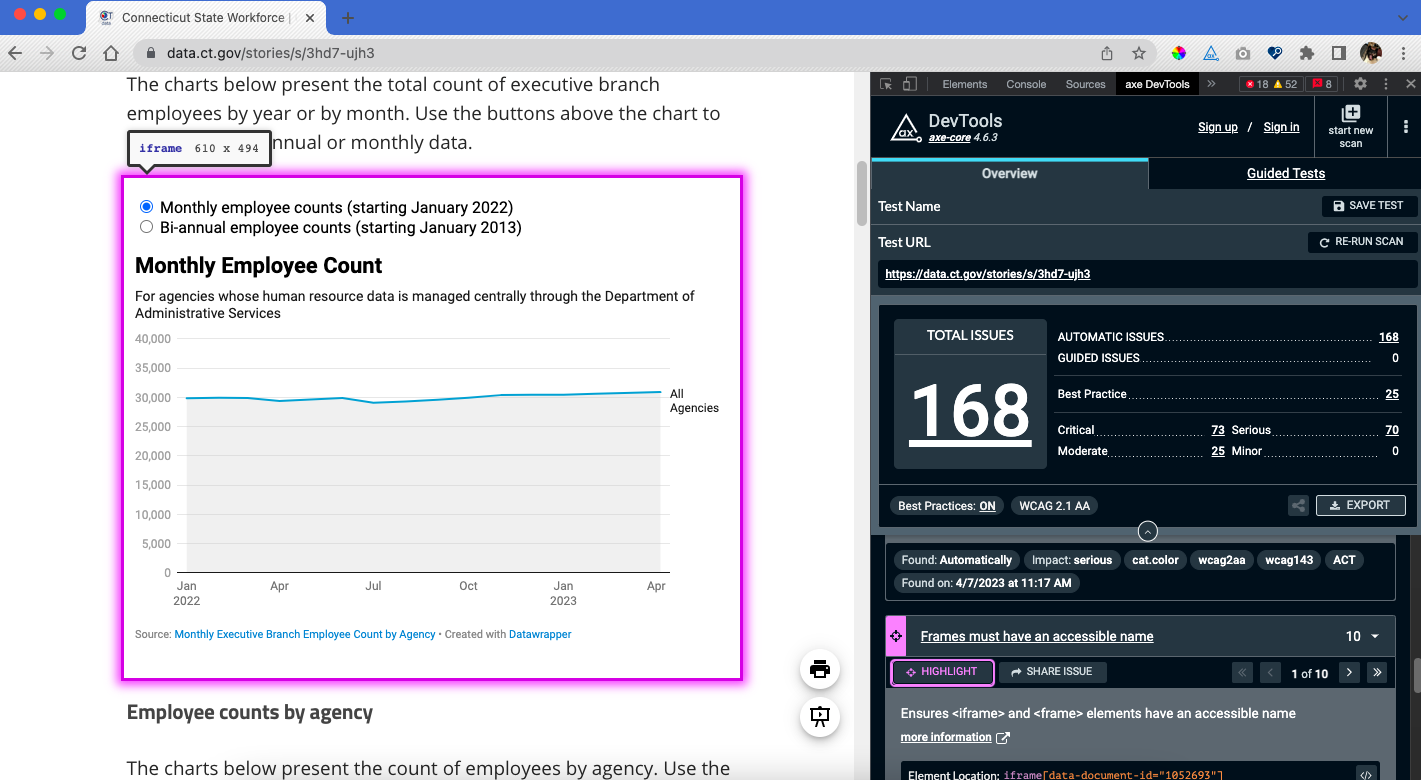
Screenshot of Axe DevTools accessibility test results for data story page
Problem statement:
Users of the Open Data Platform need an easy way to check the accessibility of their data stories because most users aren’t familiar with accessibility issues.
Ideate
Feature prioritization
I began by brainstorming features that could be included in an accessibility checker based on my comparative analysis and user interviews. I then prioritized the features to determine which were essential, which would be nice to have, and which could come later.
Must-have features
- Panel for accessibility checks in data story tool. Grouping accessibility resources in a new panel in the data story tool
- Link to accessibility testing panel from Publication screens. Publication flow refers users to the accessibility checking flow from the publication screens
- Automated accessibility test integrated into data story tool. The first accessibility checking flow will be an automated test, which should catch about 57% of accessibility issues
- Checklist of accessibility items to check manually. The second accessibility checking flow will be guidance on how to manually check for select accessibility issues, based on the Chartability heuristics
- Guidance on how to fix each issue identified. The presentation of the test results will include guidance on how to fix each issue identified
Nice-to-have features
- Unobtrusive notification when accessibility issues are present. Information about accessibility, including a notice that accessibility issues are present in the data story, should also be included outside the Accessibility panel
- Annotation of data story page to highlight issues identified. Results of automated accessibility test should make it easy for users to see where on the page the issue occurs
- Automated accessibility test for whole data story page or a specific component (ie an embedded data visualization). Users can run an automated test on the whole page or on a specific element
- Information about why each issue identified matters. A short description of why each issue identified is important
- Link to introductory article or how-to video for first-time users. Users can access an introductory article or how-to video for support in getting started with the tool
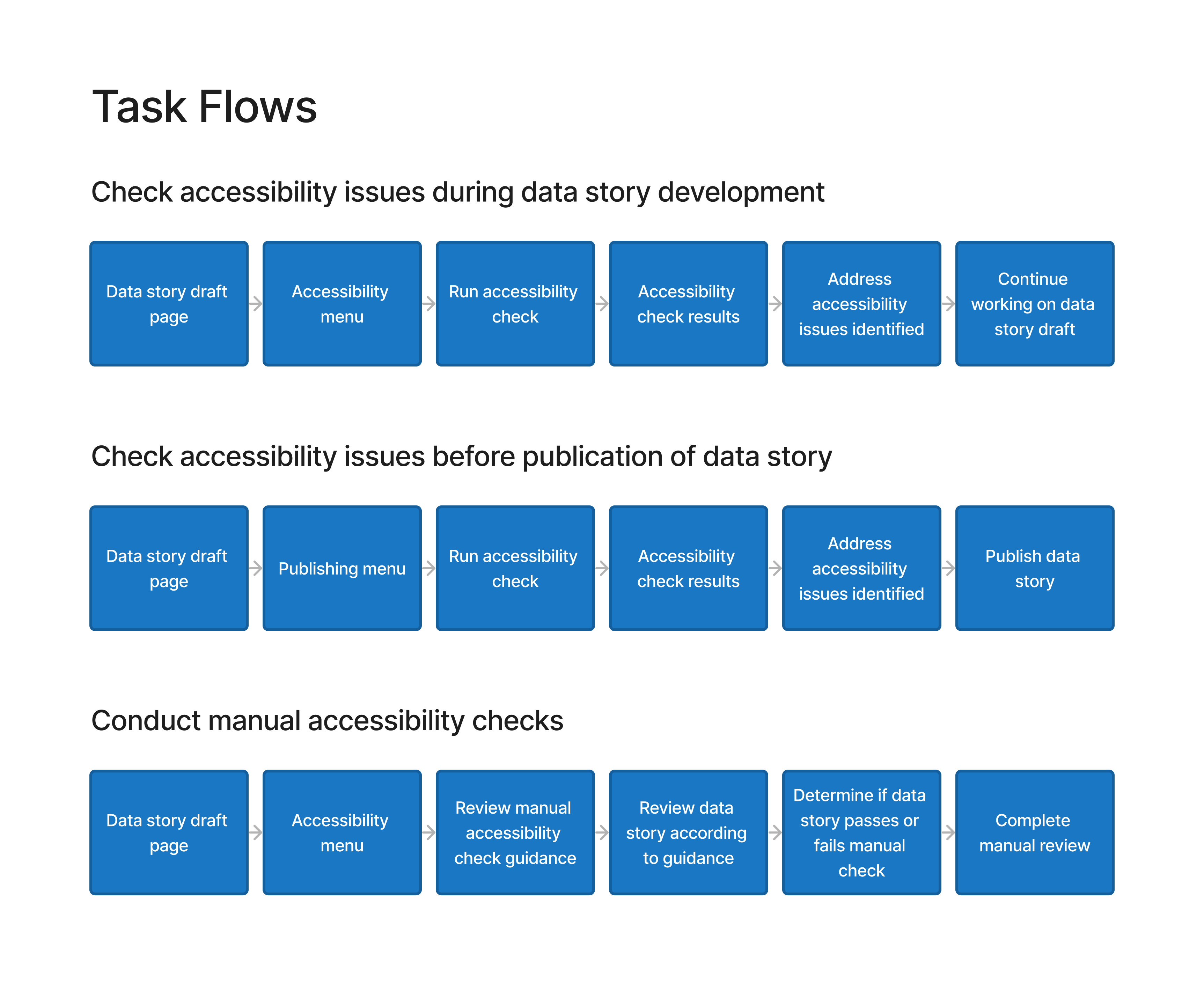
User and task flows
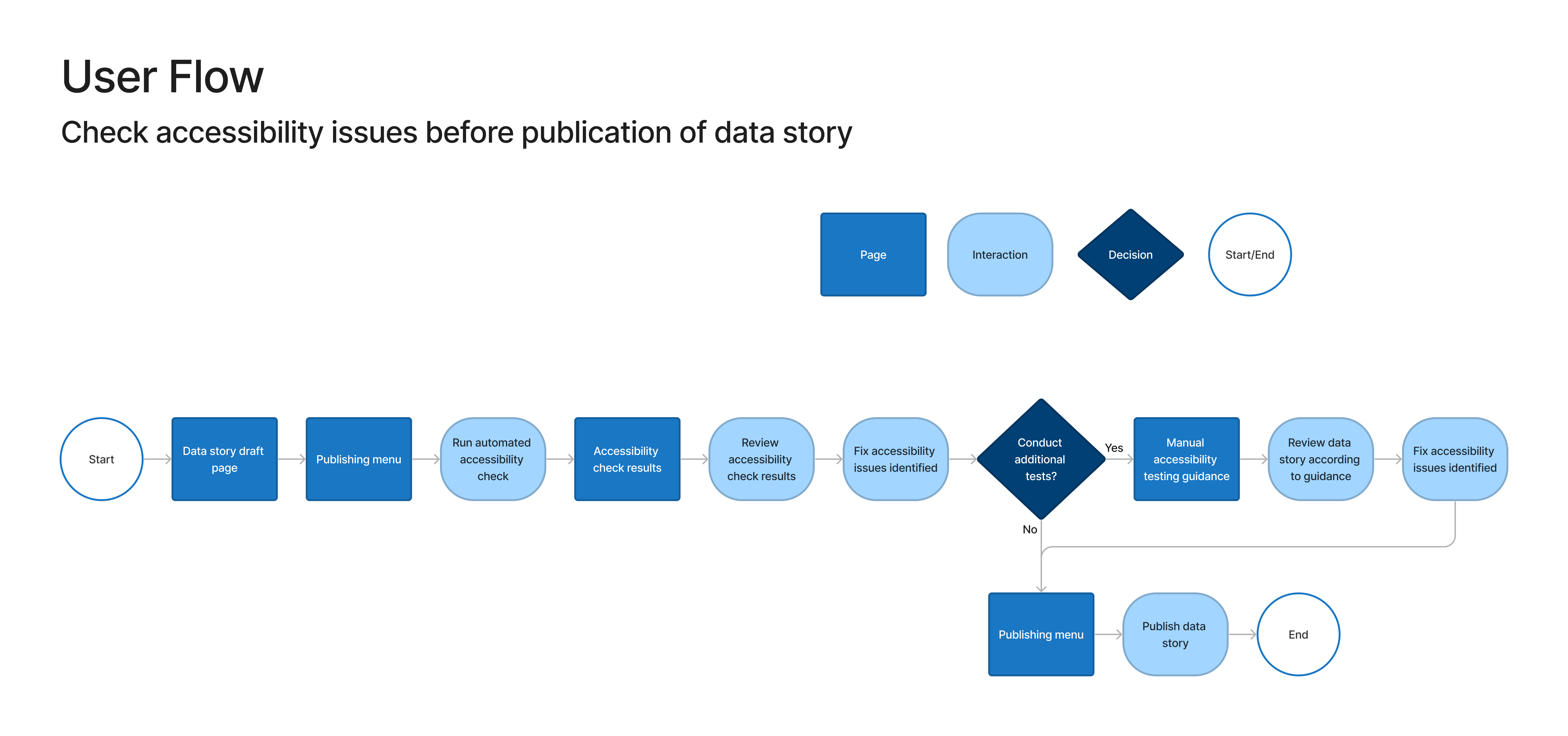
I designed a user flow for checking accessibility issues in a data story before publication. I also designed two task flows: one for running an automated accessibility scan and one for conducting manual accessibility testing.
Test
Usability testing
I conducted moderated, remote usability tests with users of the data story tool to understand:
- Can users use the accessibility checker to identify and resolve accessibility issues in a data story?
- Can users locate resources on accessibility within the data story tool?
- Can users use the manual testing guidance to conduct further accessibility testing in the data story?
- What challenges do users encounter when checking the accessibility of a data story?
- How satisfied are users with the experience of using the accessibility checker?
Takeaways
The usability tests revealed some things that worked well with the design and some areas for improvement. I addressed the usability issues that were identified through testing in the design of my final prototype.
What worked well
- Meeting a need. All participants indicated that they saw a need for this tool to increase accessibility on the Open Data Platform and said they would use this feature.
- Highlighting errors in the data story. 60% of participants were able to see where errors were occurring in the data story and understand what had to be resolved.
- Motivation to fix errors. 60% of participants expressed wanting to go beyond the minimum requirements and address all accessibility errors that were identified before publishing the data story.
What could be improved
- Overwhelming initial results from automated test. 80% of participants were overwhelmed by the initial display of the results of the automated test.
- Need to make manual testing more approachable. 80% of participants expressed that the manual testing was overwhelming, should include clearer guidance on how to conduct the checks, and should be broken into more manageable chunks.
- Reduce technical language and jargon. 60% of participants noted some language in the manual testing tool was hard to understand.
- Need a clearer introduction to the accessibility tools. 40% of participants needed additional context to understand how the accessibility checker fit into the data story publication process.
Revisions
I used the results of my usability tests to determine my priority revisions, including the three detailed below.
Problem #1
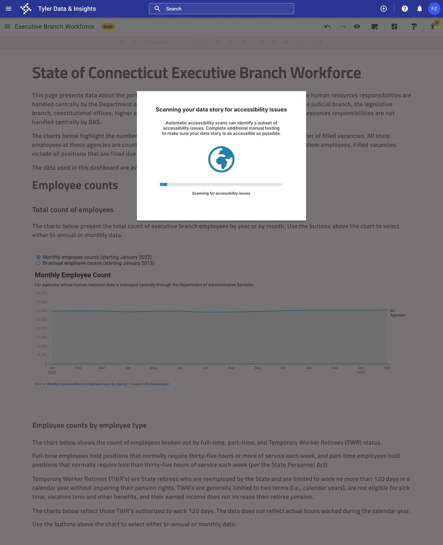
Overwhelming initial results from automated test.

Solution
I added a transition screen before the test results, and I closed the accordion menu on the first screen of the test results.
Problem #2
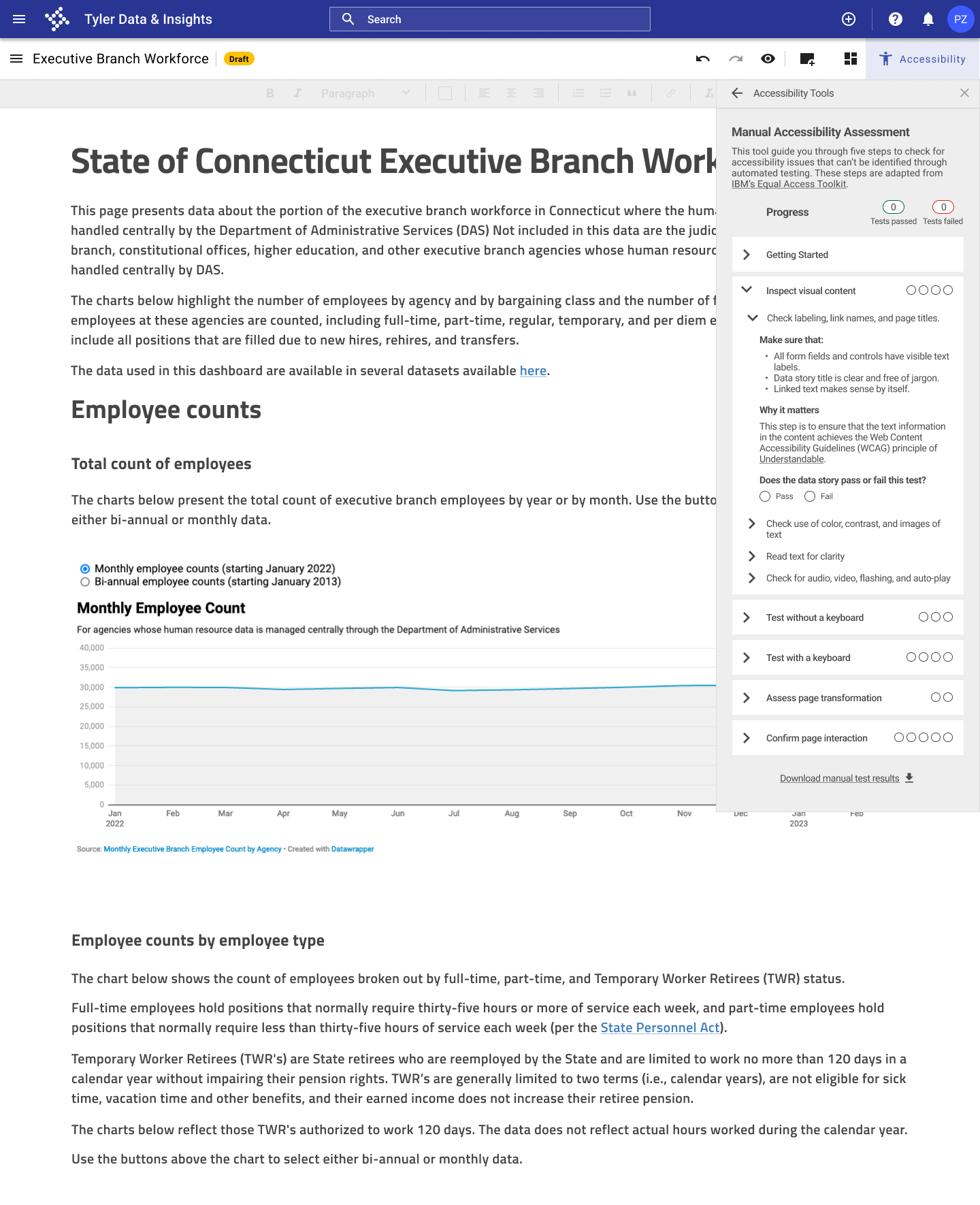
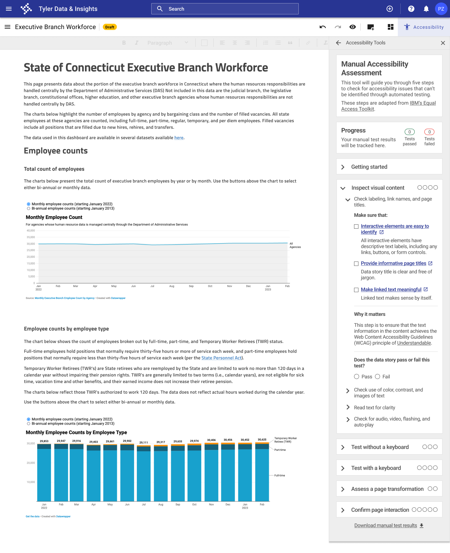
Need to make manual testing more approachable.
Solution
I clearly highlighted each manual check, and I added resources from the Web Accessibility Initiative for each check to help users complete the checks.
Problem #3
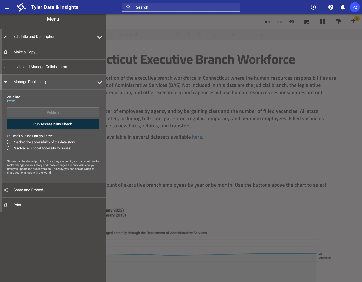
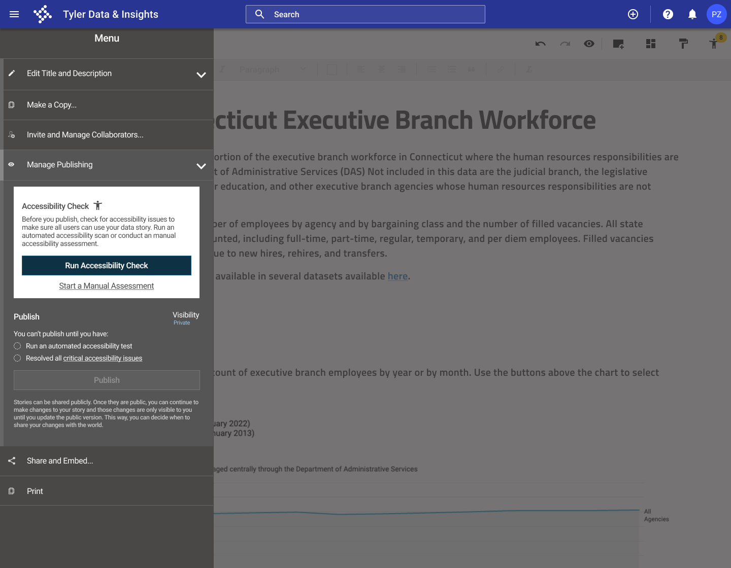
Need a clearer introduction to the accessibility tools.
Solution
I added a clear introduction to the accessibility checker in the publishing panel, and clearly explained the accessibility requirements before publication.
Final design
After working through several iterations of my design and testing a prototype with potential users, I developed the final prototype of the accessibility checker for the Open Data Platform.
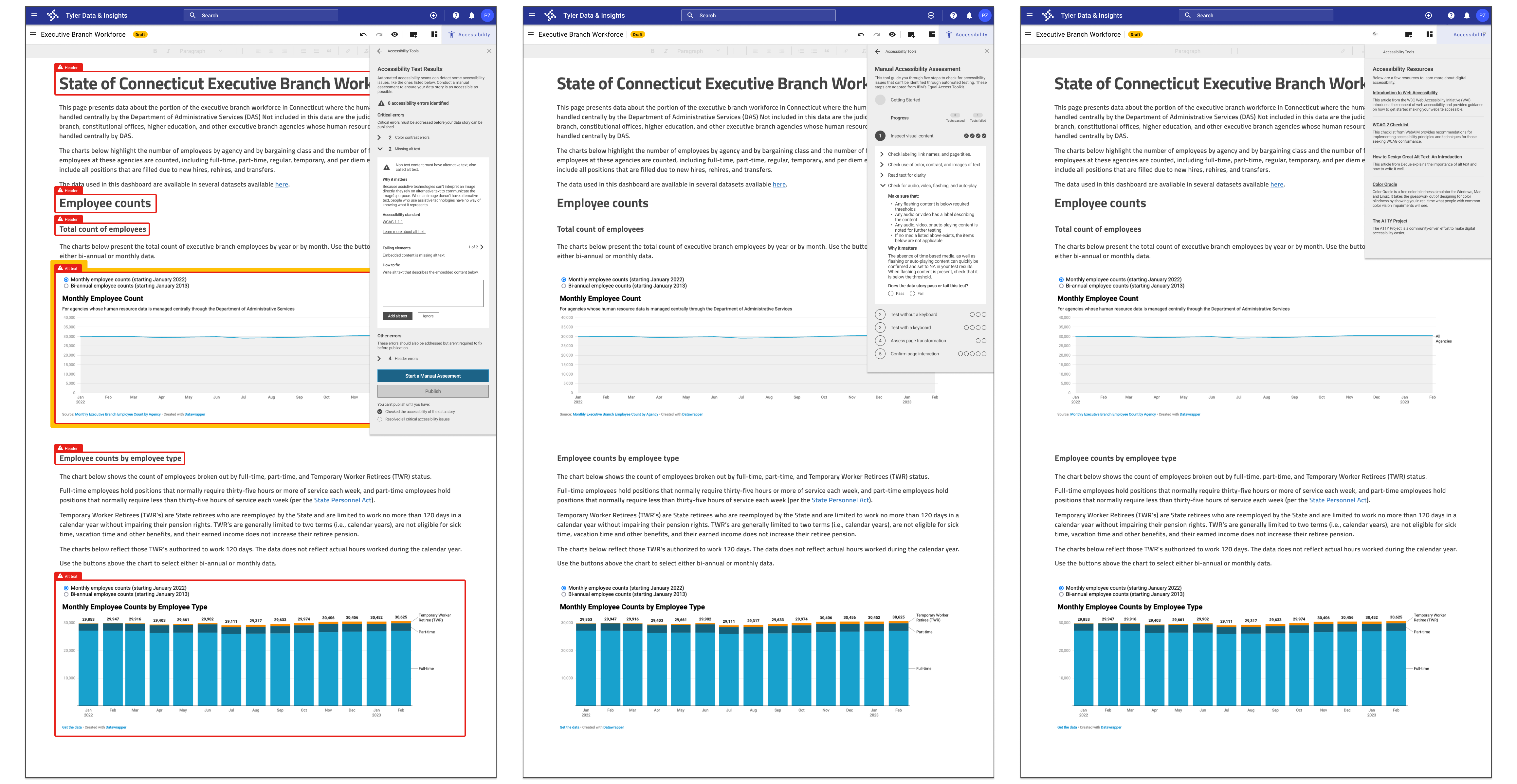
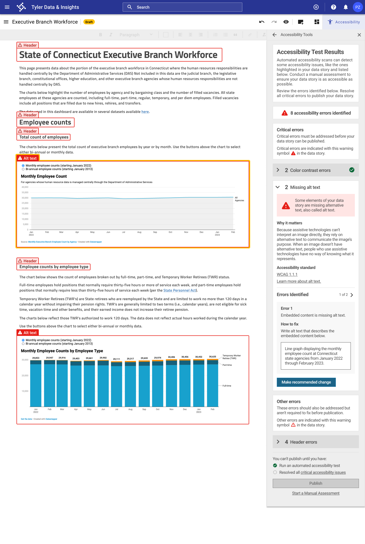
Automated accessibility testing process in the data story tool
Automatic accessibility testing integrated into the data story publication process
- Users must run an automated accessibility test before publishing a data story to ensure that the most common accessibility issues have been resolved.
- Accessibility issues are highlighted in the data story to make it clear where issues are occurring.
- Users can fix accessibility issues like insufficient color contrast and missing alt text directly in the accessibility panel.
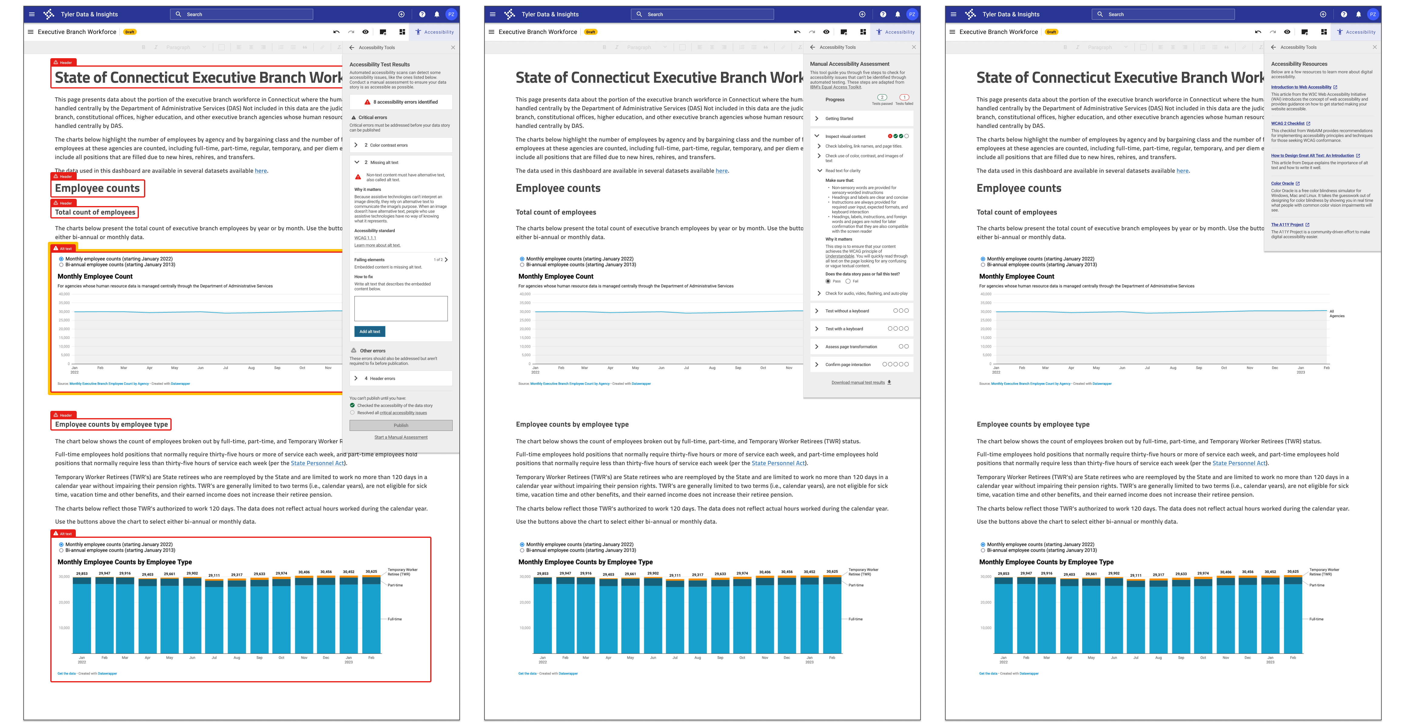
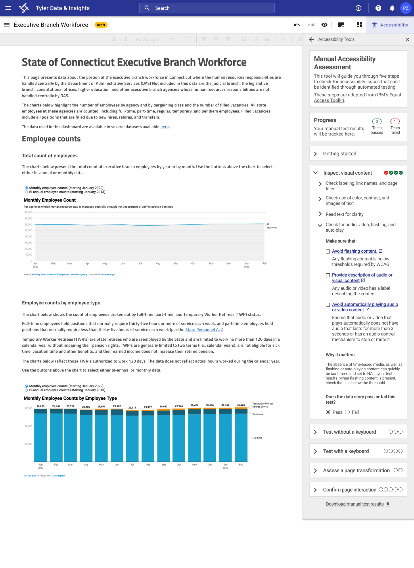
Guidance on conducting additional manual testing to go beyond automated testing, which only catches a subset of accessibility issues
- Users are walked through steps for conducting manual accessibility testing using a checklist adapted from IBM's Equal Access Toolkit.
- Users can check off each manual testing item in the accessibility panel and keep track of how many manual tests their data story passed and failed.
- Each manual testing item includes a link to additional resources to learn more about the issue and how to resolve it.
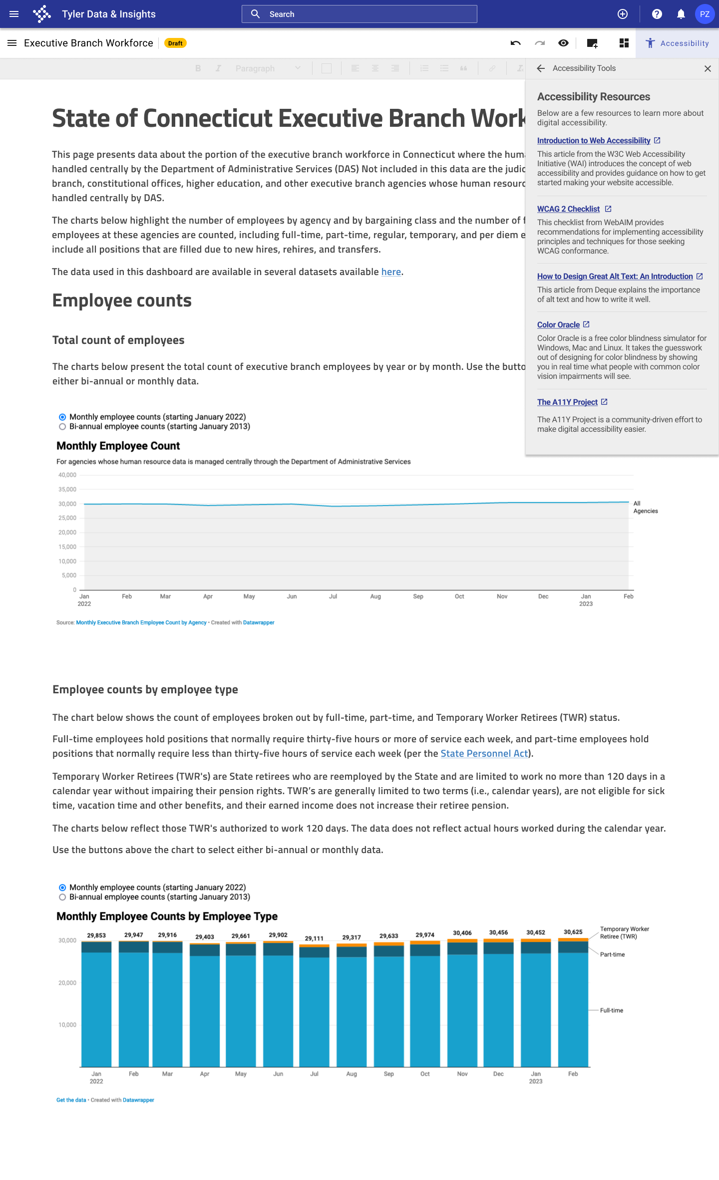
Accessibility resources available in the data story tool to help users learn more
- Users can access additional resources on accessibility, including an introduction to web accessibility, a checklist for Web Content Accessibility Guidelines (WCAG) 2, and resources on writing alt text and creating accessible color palettes.
Next steps
- Build out flows for additional testing. Develop screens to illustrate how accessibility issues other than those featured in my prototype would be identified and addressed.
- Add more features to provide additional support. Add features that were included in the "nice-to-have" category during feature prioritization, such as the ability to test a part of a data story in addition to testing the whole page.
- Further develop the library of resources. Add greater functionality to the "Accessibility Resources" panel, including the ability to browse articles by topic.
Lessons learned
- In my secondary research for this project, I learned about the need for more attention to accessibility in web design. One notable finding was from the 2022 WebAIM accessibility assessment of the top 1 million home pages, which found that 96.8% of the websites reviewed failed basic, automated accessibility tests. One of my biggest takeaways from this project is the importance of accessible design to make sure that the Internet provides equal access and equal opportunity to people with diverse abilities.
- Because of the technical nature of accessibility testing processes and test results, I also learned through this project how to approach making detailed, technical information digestible for users. When I tested my original prototype with users, some responded to the initial accessibility test results screen by saying "Whoa, this is a lot!" In the revisions of my design, I incorporated transition screens, broke the content into more manageable chunks, removed unnecessary technical language, and incorporated bullet points and check lists to break up the content.
- I learned how to approach adding a new feature to an existing product and how to incorporate a new process into existing user flows. I had to be mindful of existing user work flows and expectations to ensure that the accessibility checking process was seamlessly integrated into the data story publication process and was viewed as adding value to the process by users.
See more of my work
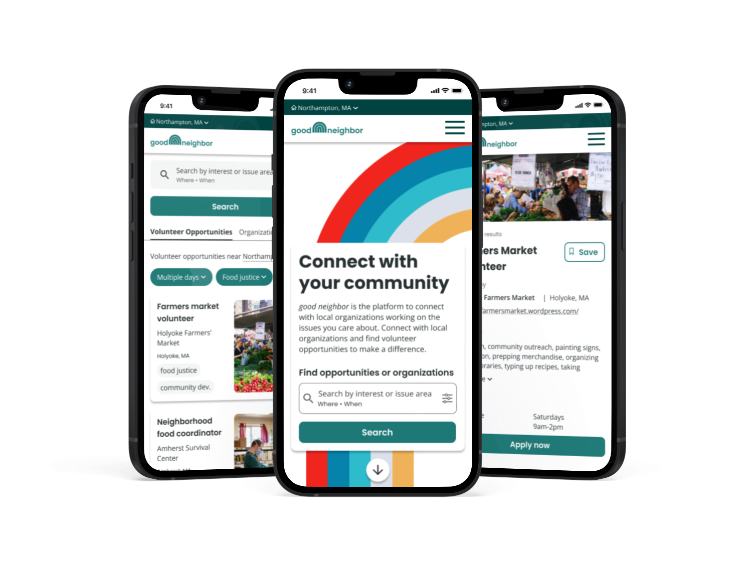
good neighborResponsive website design
