Project overview
Background
The good neighbor mobile website was inspired by the experience of moving to a new place and wanting to get involved in a new community.
Problem
It can be difficult to find ways to get involved in your community. The process of searching for information about local issues and organizations can be time-consuming, and it’s hard to find ways to get involved that match your interests and fit into your schedule.
Goal
To design a solution that would make it easier for people to become civically engaged in their communities by understanding their motivations, needs, and pain points.
Solution
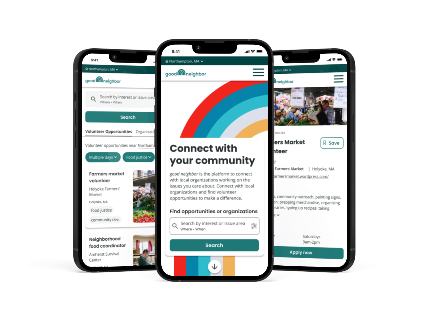
I designed was a mobile-first website to connect users with volunteer opportunities in their communities to promote civic engagement. The website, called good neighbor, provides relevant information about local organizations and helps users easily find ways to get involved that match their interests and fit into their schedules, making it easy for users to connect with their communities through volunteering.
Timeline
September - December 2022
My role
End-to-end UX/UI designer. Responsible for user research, prototyping, and testing
Tools used
Figma, Miro, Optimal Workshop, Calendly
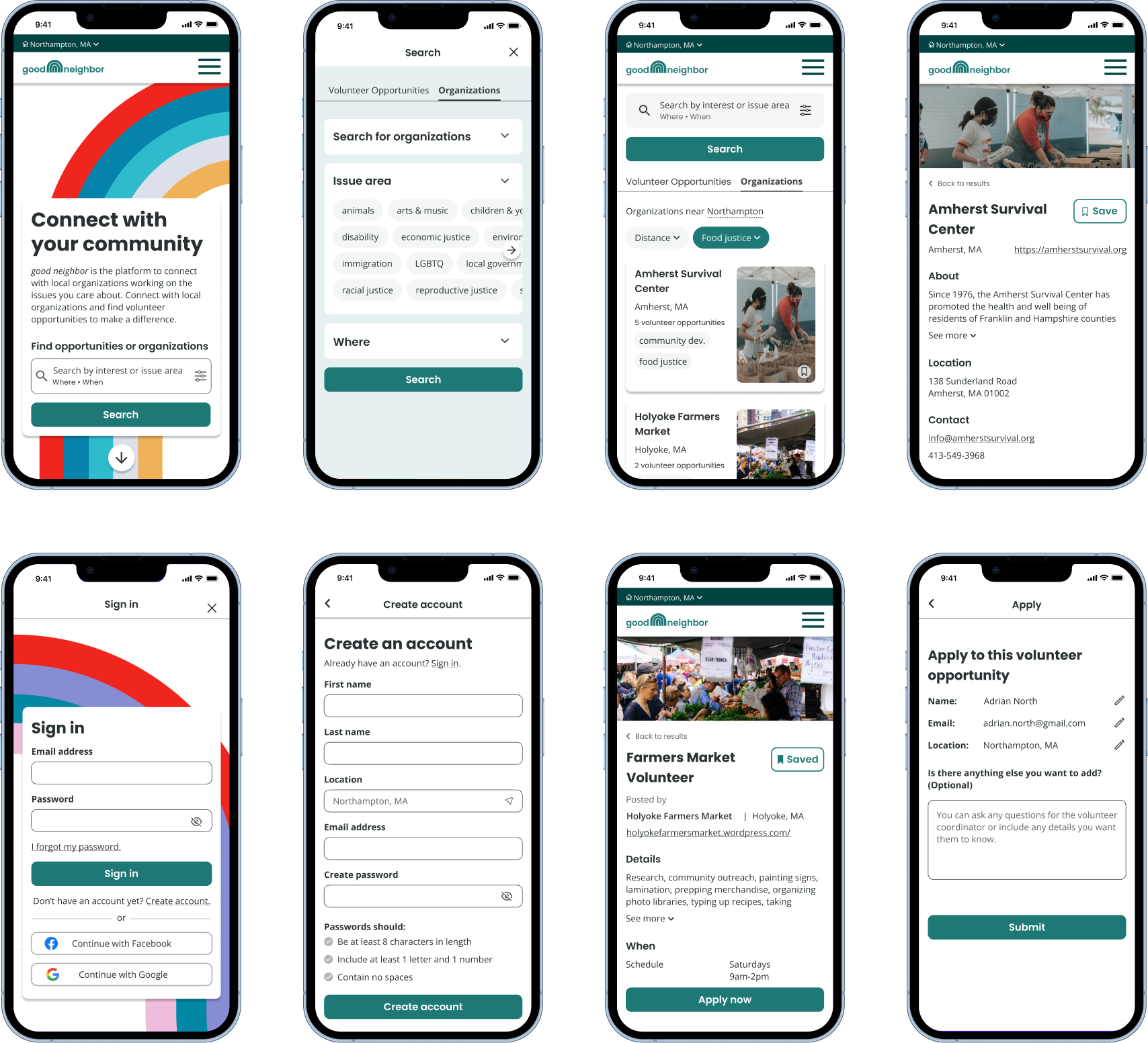
Screens from the good neighbor mobile website
Design process
Empathize
User interviews
I conducted eight interviews with people who had experience moving to a new place and finding ways to get involved with their communities through volunteer or other civic engagement. The findings below summarize how participants wanted to engage with their communities, how they approached finding opportunities for civic engagement, and the pain points they had experienced when trying to get more involved.
User goals
- Become more engaged. Participants wanted to increase their level of community engagement through either government or community organization involvement.
- Find a good fit. They wanted to find ways to engage that matched their interests and would fit with their schedules.
- Feel connected. They wanted to meet their neighbors and feel like they were part of their community.
Current approaches
- Searching online. Participants searched for information about local issues and organizations online, often hunting for information for hours.
- Social media. They looked for information about local issues on social media including Facebook, Instagram, Tik Tok, Discord, and Next Door.
- Talking to people offline. They noted the importance of connecting to people rather than just finding information online.
Pain points
- Finding local information. Participants struggled to find information about local government, grassroots organizations, or issues impacting the local community.
- Time-consuming search. Participants described needing to gather a lot of information to feel like they could get involved.
- Scheduling troubles. One of the most challenging parts for participants was finding opportunities that fit with their schedules.
User persona
Based on the interview findings, I developed a user persona, which I referenced during the design process to ensure I was addressing the user needs. My persona represented users who want to get involved in their community but are frustrated by the time-consuming process of searching for information about local organizations online.
Through my user research, I found a need for an easy way for people to find information about local organizations and volunteer opportunities that aligns with their interest and fits into their busy lives.
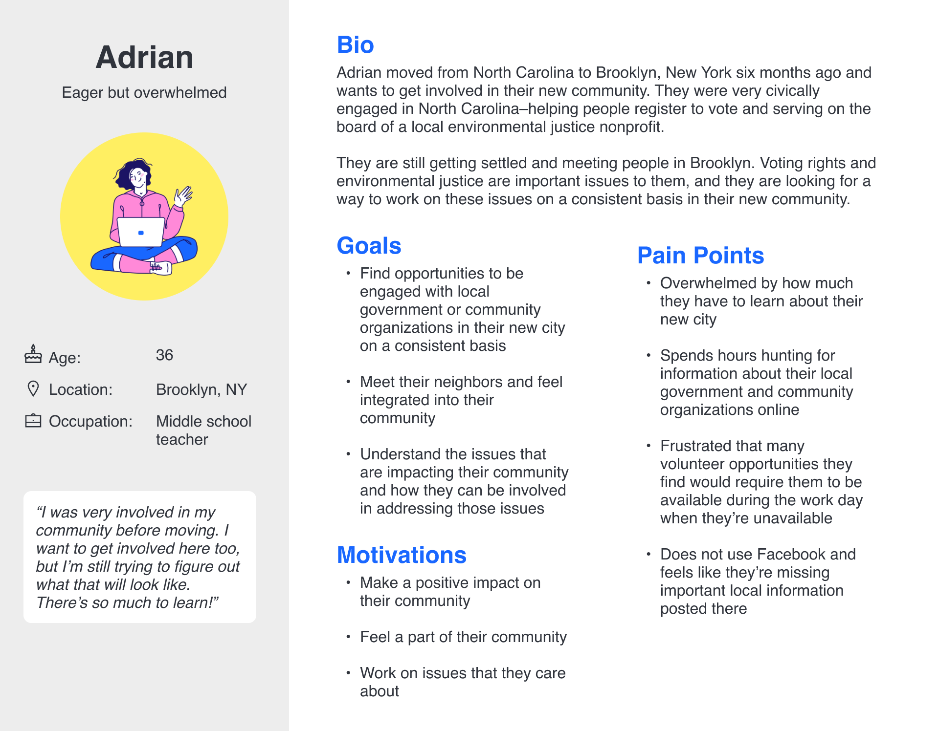
User persona for good neighbor
Define
Comparative analysis
I reviewed other examples of websites that aim to help their users connect with their communities. I analyzed three websites to understand successful practices and gaps. I reviewed three sites: Volunteer Match, Do Something, and Next Door.
Takeaways
- The ability to easily filter content by location and topics of interest is essential to allow users to find ways to engage with their communities are relevant and meaningful to them.
- There is a need for a listing of civic engagement opportunities that include smaller organizations, local government, and community events.
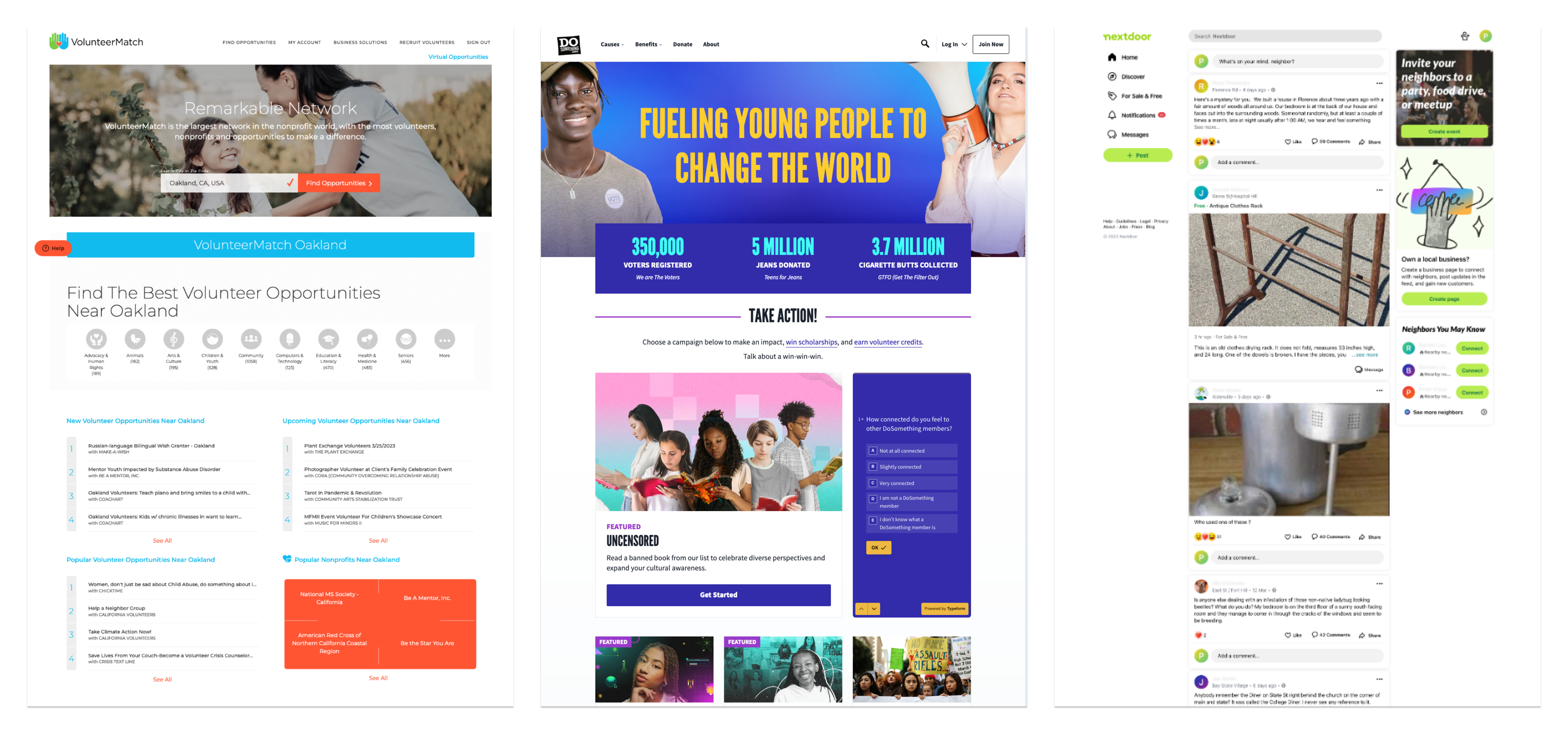
Screenshots of VolunteerMatch, Do Something, and Next Door
Project goals
After analyzing the data from my user research, I began to brainstorm possible solutions. I compared user needs, the goals of local community organizations, and technical requirements to determine the project goals.
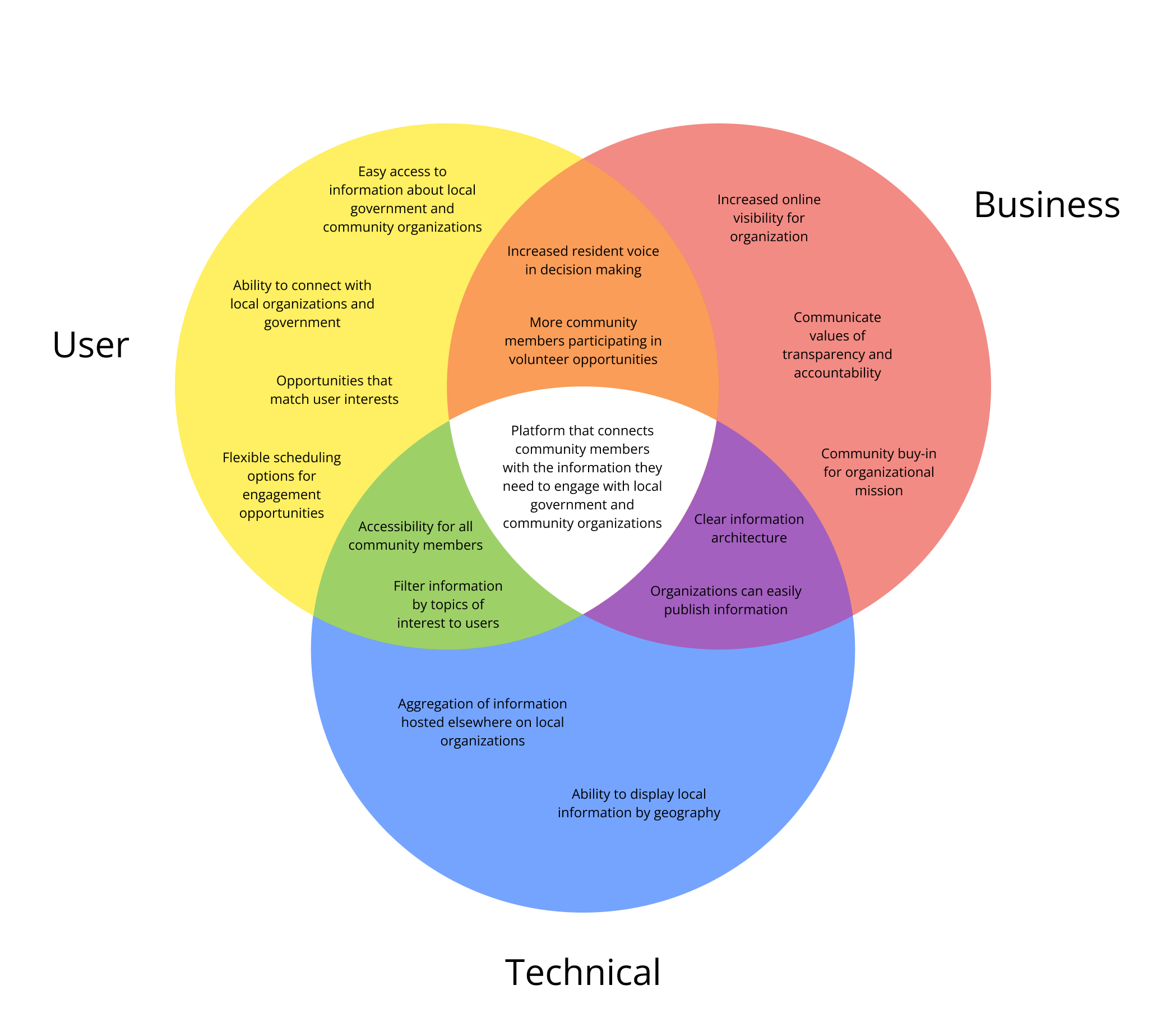
Venn diagram showing the project goals for good neighbor
People need help finding relevant information about local government and community organizations because they struggle to find hyperlocal information searching online.
Ideate
Feature prioritization
I began by brainstorming features that could be included in my design based on my comparative analysis and user interviews. I then prioritized the features to determine which were essential, which would be nice to have, and which could come later.
Must-have features
- Account creation for community members. Community user registration, sign in, and account page so they can access their profile page, chats, and saved events, organizations, or engagements
- Community member profile page. Profile page for community members to list their issues of interest, their skills/experience, and what they're looking for
- Organizational profile page. Organizational profile page for organizations to provide information about their work, mission, etc.
- Community engagement opportunity detail page. Page listing details of a community engagement opportunities including location, schedule, time commitment, desired skills, etc.
- Search and filter. Search for organizations, engagement opportunities, and events
Nice-to-have features
- Ability for users to follow organizations of interest. Feature allowing community users to save or follow organizations they're interested in
- Ability to save engagement opportunities of interest. Feature allowing community users to save volunteer opportunities that they're interested in
- Ability to express interest or sign up for an opportunity. Ability for community members to sign up or express interest in an opportunity in the site
- Messaging between users and organizations. Messaging that allows community users to contact organizations directly through the site to ask questions or express interest
- Event pages for volunteer events or meetings. Pages with event-specific information such as community meetings or volunteer events
Style and branding
In addition to brainstorming which features to include in my mobile website, I also needed to develop consistent style and branding elements. After exploring different color, typography, and logo options, I developed the style tile below to guide the look and feel of my website.
- Color palette. I chose greeny blue as the primary color with bright yellow as secondary colors. The light blues aim to evoke a sense of caring and trust, and the yellow represents happiness and a sense of welcome.
- Typography. I chose Poppins for the headings in my design because of its versatility and modern feel. I chose Open Sans for the body text for its clean look and highly legibility.
- Logo. I created a simple rainbow icon to create a sense of positivity and connectedness.
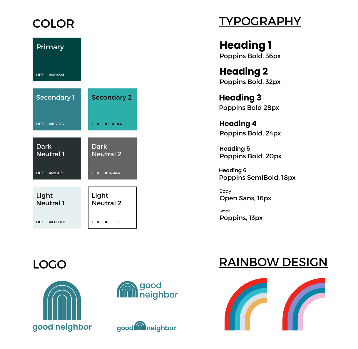
Style tile for the good neighbor mobile website
Prototype
Wireframes
I developed several iterations of low- and mid-fidelity wireframes, leading to the design of my high-fidelity prototype that I would test with users.
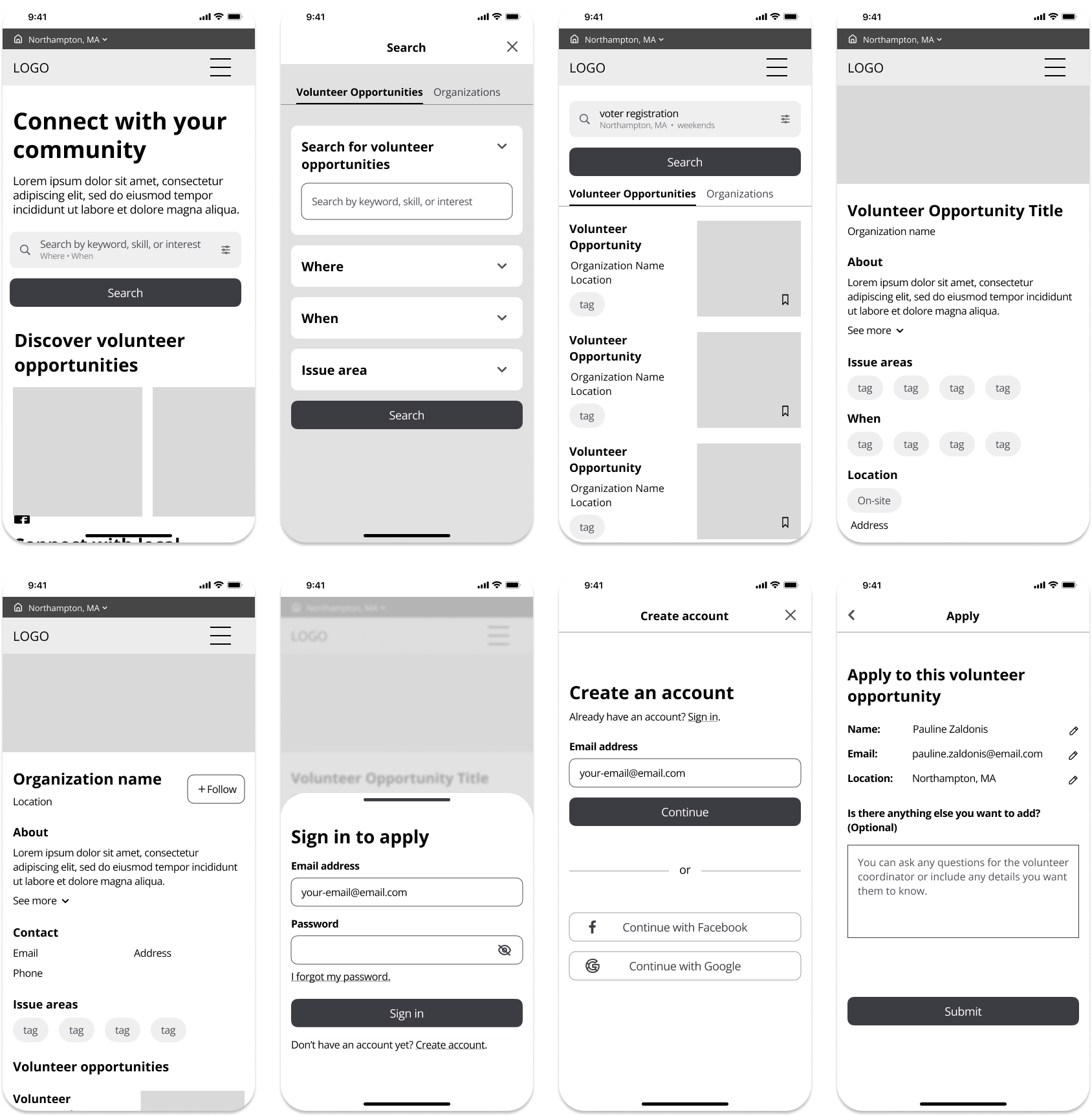
Low-fidelity wireframes for the good neighbor mobile website
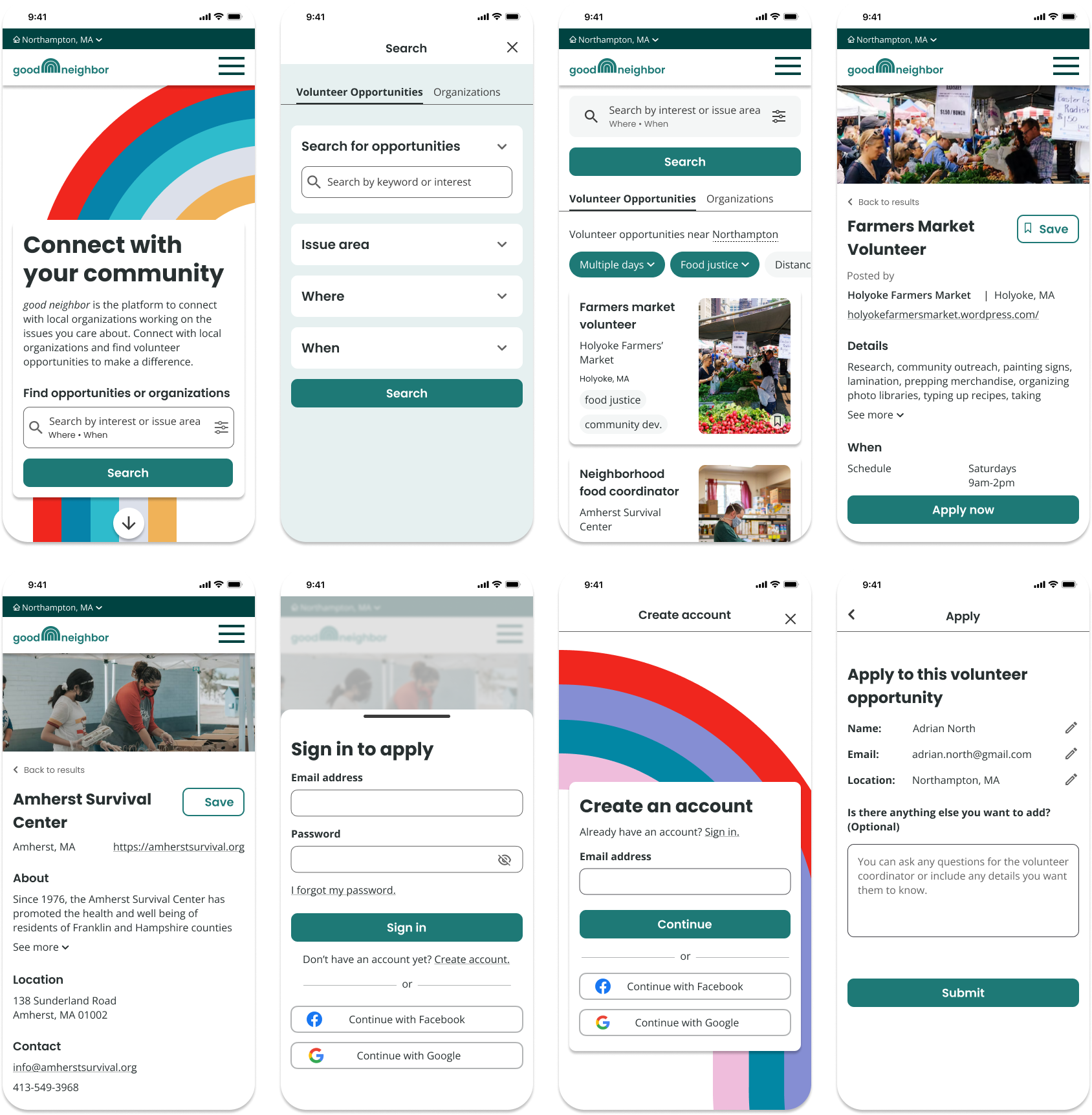
High-fidelity wireframes for the good neighbor mobile website
Test
Usability testing
I tested a high-fidelity prototype with potential users. I conducted moderated, remote usability tests to understand:
- Can users find and apply for a volunteer opportunity that matches their interests and meets their requirements?
- Can users find organizations that interest them and save them to their favorites?
- How do users approach the task of finding a volunteer opportunity that meets their requirements?
- What challenges do users encounter when searching for organizations and volunteer opportunities?
- How satisfied are users with the experience of finding volunteer opportunities on good neighbor?
Takeaways
What worked well
- Visual design - 80% of users gave positive feedback about the color palette and imagery
- Search functionality - 60% of users commented that the search and filter functionality was useful and efficient
- Application process - 40% of users commented that the process of applying to a volunteer opportunity was fast and easy
- Homepage layout - 40% of users described the homepage layout as “intuitive”
- Clear messaging - 40% of users noted that the messaging of “connect with your community” stood out to them
- Bookmarking - 40% of users commented that they liked the ability to save organizations and volunteer opportunities
What could be improved
- Application submittal verification - All users suggested adding clear verification after applying to a volunteer opportunity
- Lengthy profile creation process - 80% of users noted the process of setting up their profile took too long and distracted from the primary task
- Clearer indication that item was saved - 40% of users indicated the clearer indication was needed to show an item was saved
- Apply button on volunteer opportunity detail screen should be more obvious - 40% of users did not immediately see how they could apply
- Unclear card hierarchy - 40% of users said the cards needed clearer hierarchy
Final design
After working through several iterations of my design and testing a prototype with potential users, I developed the final prototype of the good neighbor website.
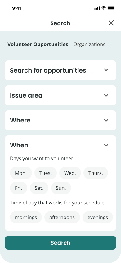
Customizable search with filters to find relevant results more quickly
Users can search for volunteer opportunities by keyword, issue area, location, and schedule. The ability to apply filters during the search ensures that users get relevant results.
An interest form to apply to volunteer easily
A simple application form allows users to apply for volunteer opportunities directly through the platform.

Save your favorite organizations and volunteer opportunities
Users can create an account to save organizations and volunteer opportunities that they’re interested in so they can come back to them later.

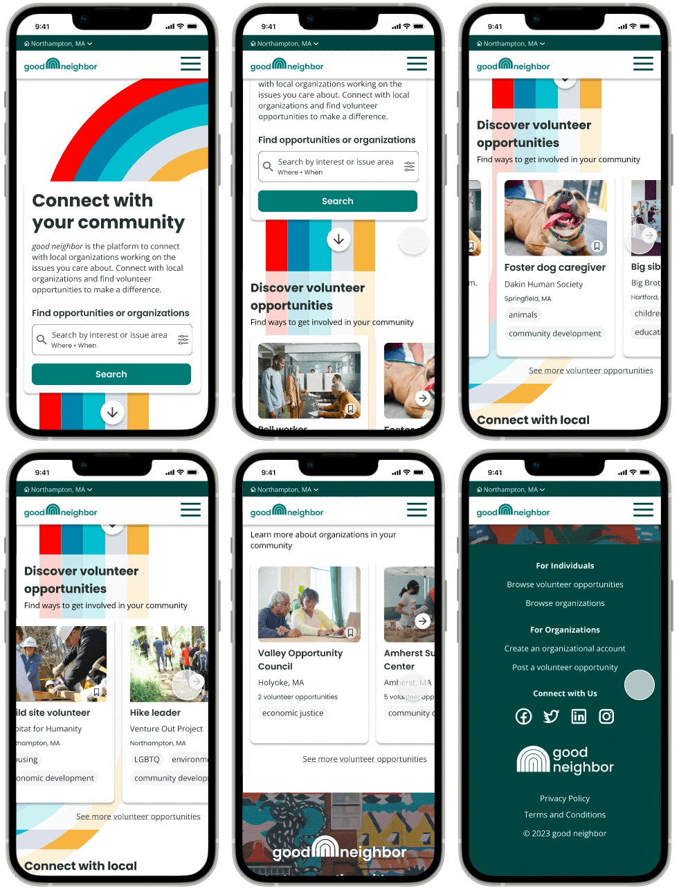
Video tour of the good neighbor homepage
Next steps
Test the app with new users to determine the effectiveness of the revisions.
- Design high-fidelity wireframes and prototype for desktop.
Lessons learned
- Keep it simple. I learned to remove clutter from my visual design and focus on things that are important to the people using my design. I tried to keep my design simple to create a clean visual design and an easy user experience.
- Design clear and direct task flows. I learned to simplify my task flows. In early iterations of my design, users had to create a profile before saving or applying to a volunteer position. When I tested my design, I learned that the lengthy profile creation process distracted from the primary task of saving or applying for a volunteer position. I updated my design to allow users to skip the full profile creation process to quickly create a profile and then resume the primary task.
See more of my work
good neighborResponsive website design
