Project overview
Background
The Public Service Loan Forgiveness (PSLF) Program is a program of the U.S. Department of Education that provides student loan forgiveness to borrowers who have worked in public service for ten years while making 120 qualifying payments on their loans. Program participants need an easier way to manage their participation in the PSLF program.
Problem
Participants in the PSLF program experience challenges navigating the program. Information is spread out across multiple locations on the U.S. Department of Education and loan servicer websites. It can be difficult for borrowers to know where to go to manage their participation in the program, including how to find out if they are eligible, to certify their employment, to apply for forgiveness, or to track their progress towards forgiveness.
Goal
To design an app for the PSLF program that makes it easy for users to manage all aspects of their participation in the program.
Solution
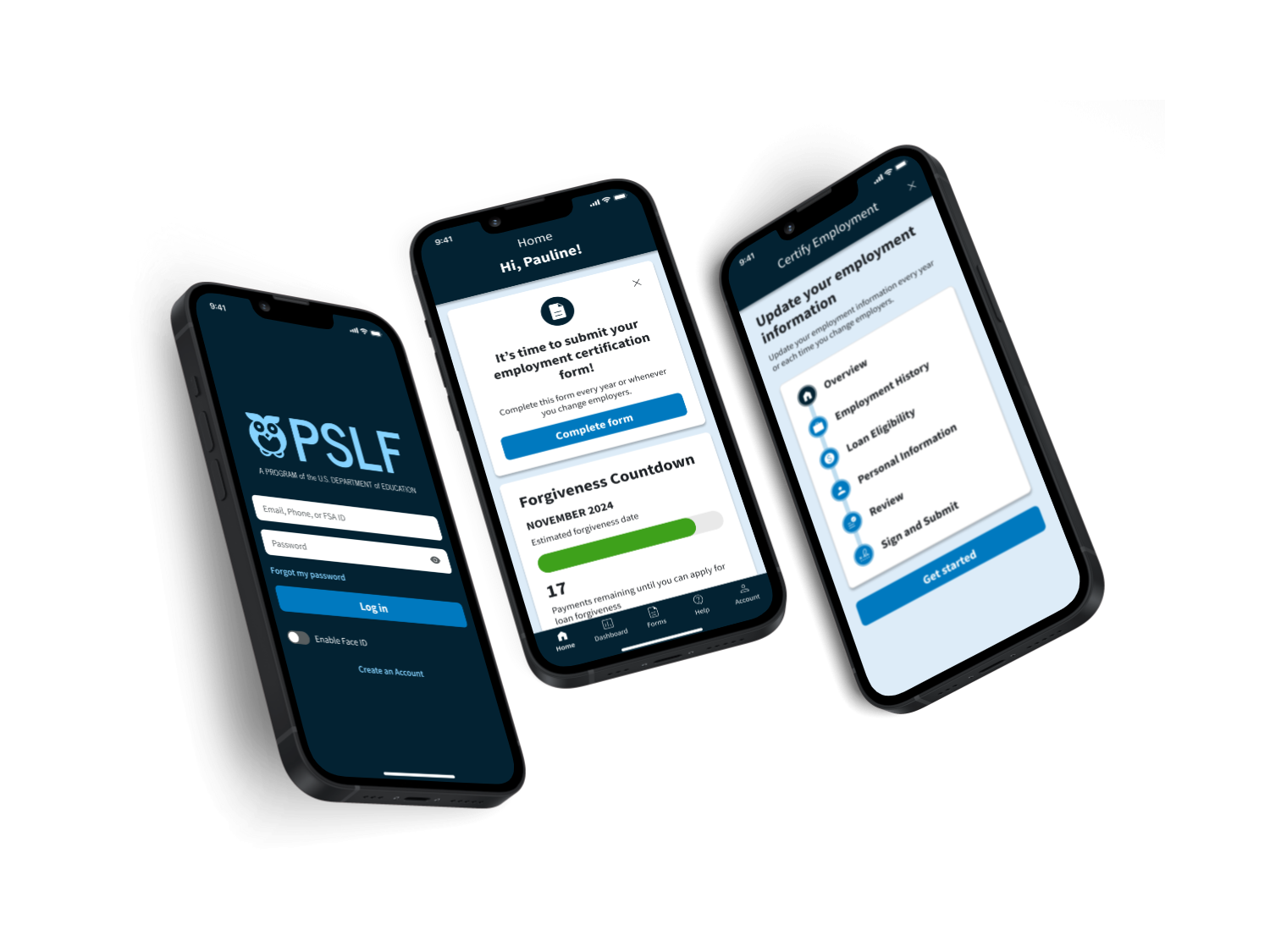
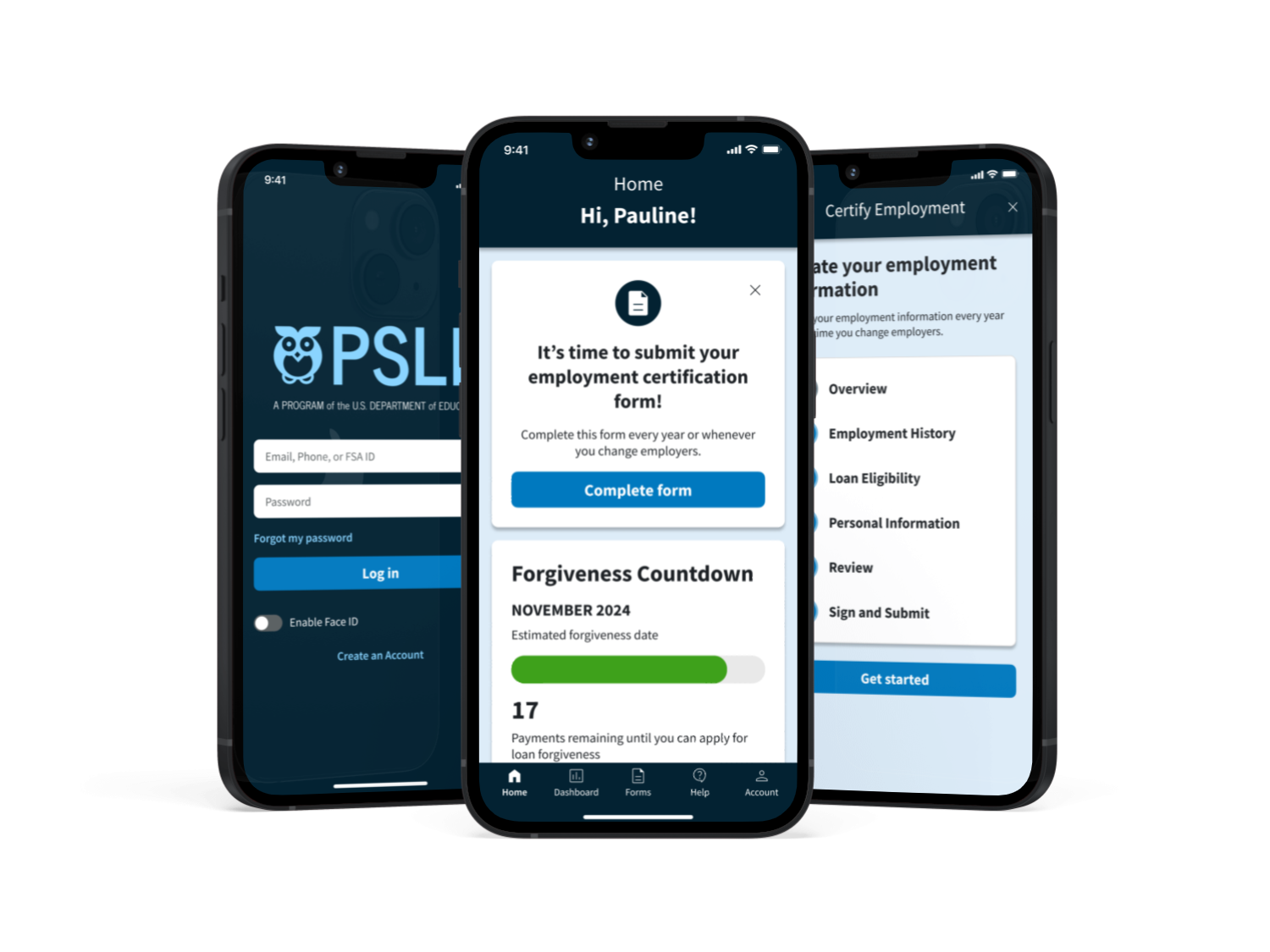
I designed a mobile app that allows users to manage and track their participation in the PSLF program in one place. I focused on the needs of current and potential PSLF participants in navigating the program.
Timeline
July - Nov 2023
My role
End-to-end UX/UI designer. Responsible for user research, prototyping, and testing
Tools used
Figma, Miro, Optimal Workshop
Design process
Empathize
Research the needs of users and understand their needs, goals, and pain points
Empathize
User interviews
I conducted seven interviews with student loan borrowers, two of whom were participants in the PSLF program. The findings below summarize the challenges, needs, and tools used by interview participants.
Challenges
- Understanding program requirements. Interviewees experienced challenges determining their eligibility for the PSLF program and understanding how their participation would be impacted by loan consolidation or changes in employment.
- Managing annual PSLF paperwork. Participants have to visit multiple websites, keep track of deadlines themselves, and sometimes wait months until the information in their account updates to match their paperwork.
- Uncertainty about progress towards loan forgiveness. There is no easy way to track real-time progress towards loan forgiveness, and PSLF participants say they're anxious that their application for loan forgiveness might not be accepted.
Needs
- Tracking progress. Users need to see if they're on track to meet the PSLF requirements and get their loans forgiven.
- Managing annual paperwork. Users need an easy way to manage the annual PSLF paperwork, including income and employment certification.
- Access to support. Users need access to financial resources and guidance from experts in managing student loans to help PSLF participants feel confident about managing their loans.
Tools used to manage student loans
- Studentaid.gov and loan servicer website. All interviewees used studentaid.gov and their student loan servicer website as the primary tools to manage their federal student loans.
- Email notifications. Interviewees rely on email notifications to remind them when to they need to do something related to their loans.
- Budgeting and tracking tools. For budgeting and tracking PSLF progress, interviewees used a mix of tools including apps like Credit Karma, Google Sheets, or a physical paper chain countdown to the date they can apply for loan forgiveness.
User personas
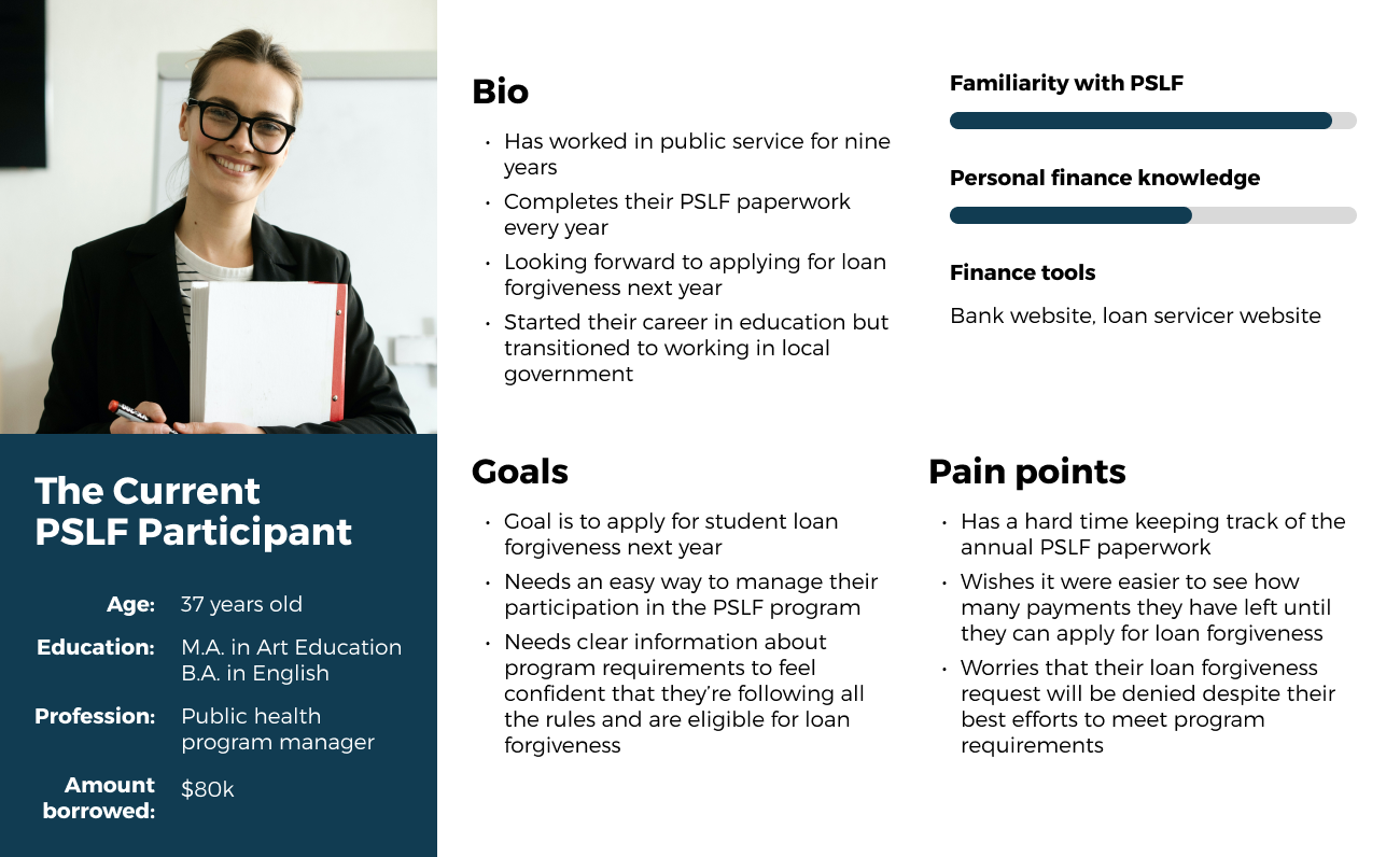
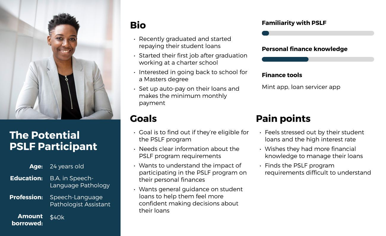
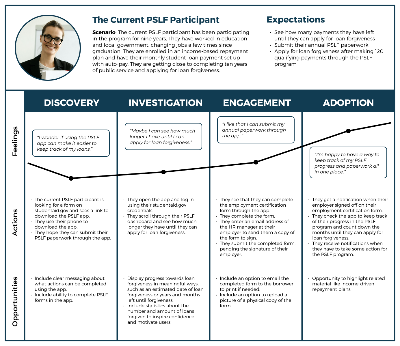
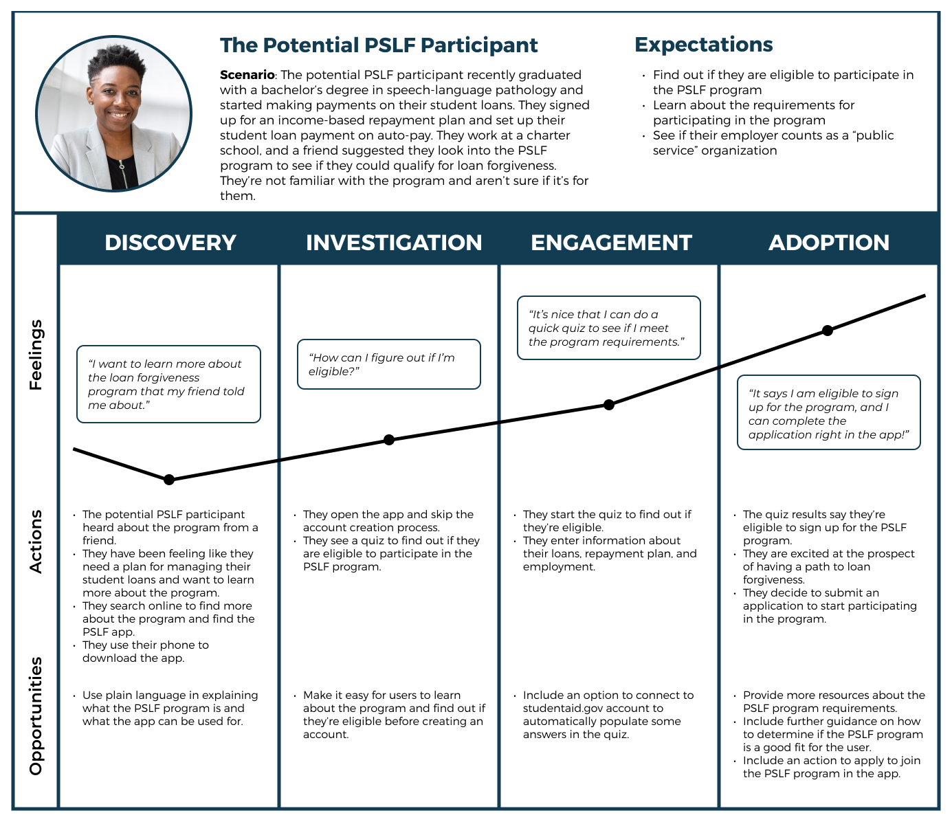
Based on the interview findings, I developed two user personas to guide the development of the PSLF app: the current and the potential PSLF participant.
User journey maps
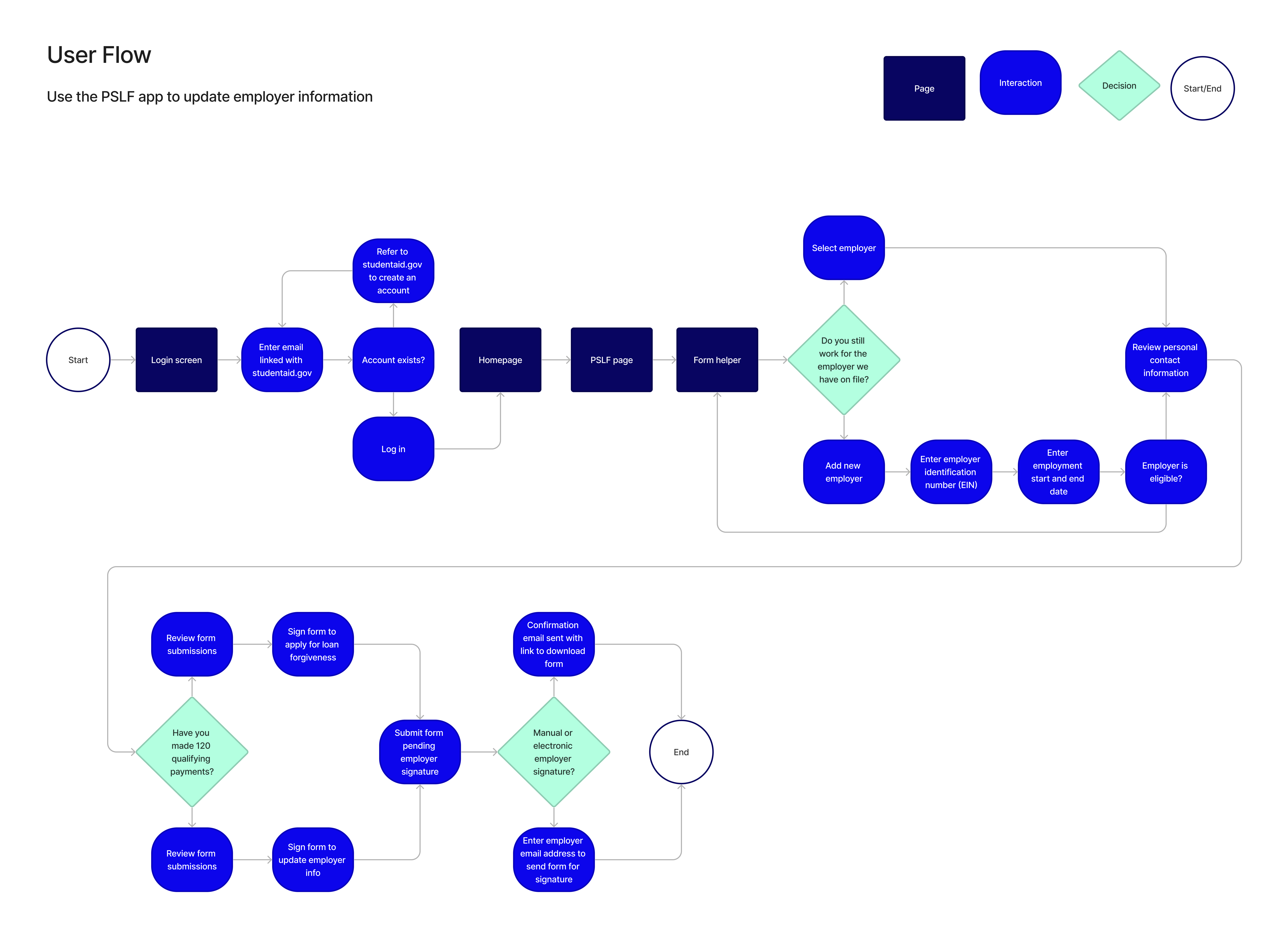
The journey maps below illustrate the experience of the current and potential PSLF participant when they encounter the PSLF app. These maps focus on how users can use the app to streamline their participation in the PSLF program.
Card sort & site map
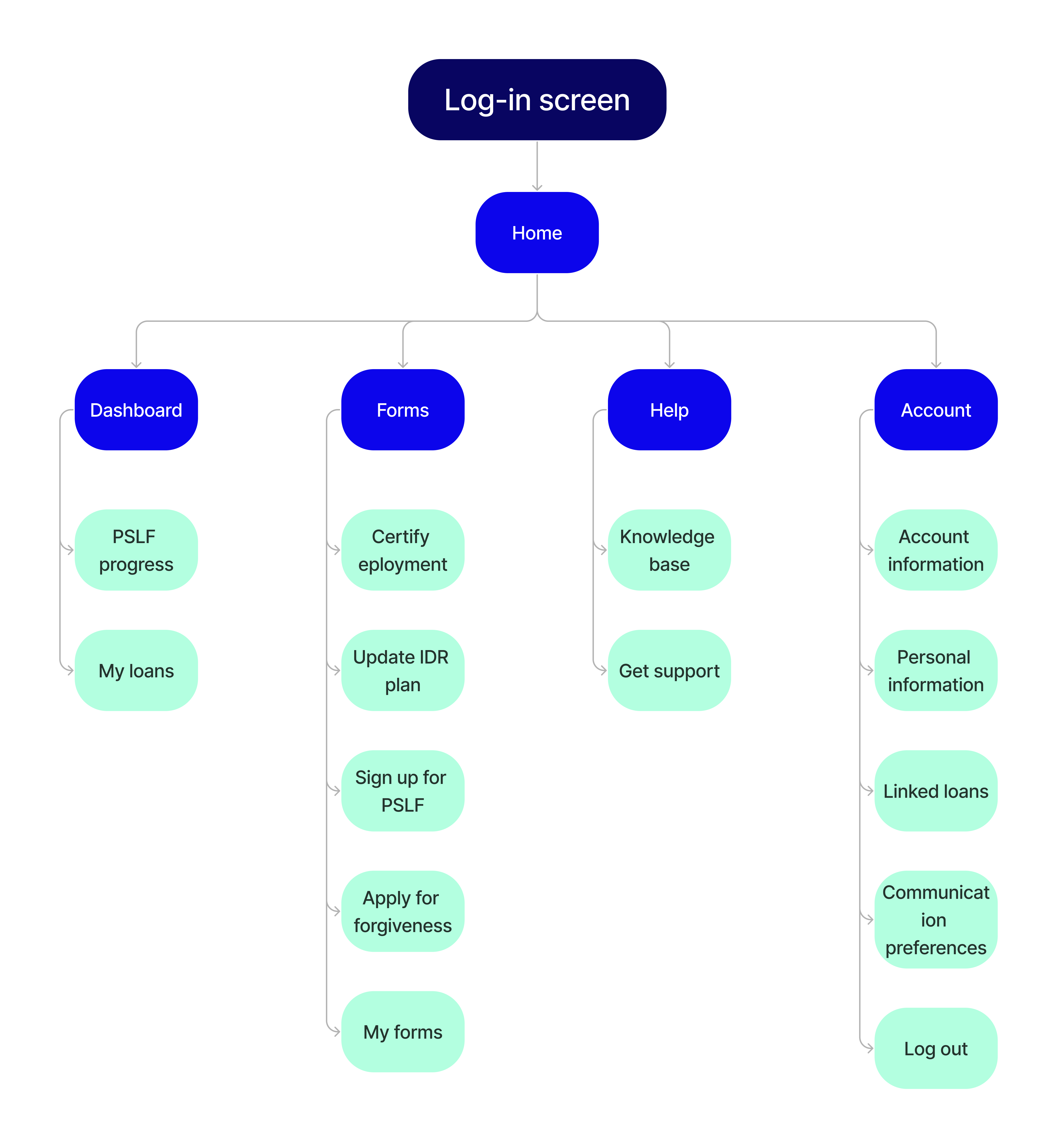
I conducted a moderated open card sort to understand the mental models of student loan borrowers and how they group information, and to inform the information architecture of the PSLF app.
Takeaways
- PSLF actions. Most users grouped together cards focusing on actions users can take related to PSLF, such as applying for loan forgiveness or checking their eligibility to participate in the program. This indicated a need for actions related to the program to be grouped together.
- Loan information. Most users created a group for information about the user's student loans, including balance overview and repayment history, suggesting a need for centralized information about loans and PSLF progress.
Define
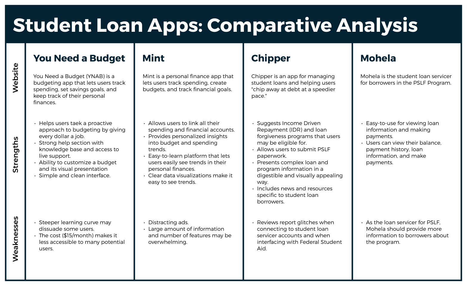
Comparative analysis
I reviewed four budgeting and student loan apps to identify best practices. I focused on the utility of the apps for managing student loans.
Takeaways
Based on the comparative analysis, I determined that effective budgeting and student loan apps:
- Are intuitive and easy-to-learn for users, making complex information digestible
- Include data visualizations to make trends easy to see
- Give insights about the user’s financial data and offers guidance and suggestions
- Provide reliable access to customer service and support
- Allow users to view personalized financial information, where appropriate
Problem statement:
PSLF participants need a seamless way to manage their PSLF participation so they feel confident about their progress towards loan forgiveness.
Ideate
Feature prioritization
I brainstormed a list of features to include in the PSLF app, prioritizing them based on whether they were essential, would be nice to have, or could come later.
Must-have features
Integration with loan servicer website. Ability to link loan servicer information with PSLF app to show payment history and account details
PSLF progress tracker. Dashboard that shows a user's progress towards loan forgiveness, including an expected forgiveness date
Annual employment certification form. Form to complete annual paperwork through the app
Annual income-based repayment plan form. Form to complete annual paperwork through the app
Loan information details. Dashboard summarizing the user's loan information, including the balance broken out by principal and interest
Nice-to-have features
Resources on student loan management. Resources to provide guidance on personal finance and student loans
- Live support feature. Ability to connect to customer service to ask questions and get advice by chat or phone
- Reminders for upcoming deadlines. Option to receive reminders about upcoming deadlines, such as annual paperwork due dates
- Stats about how many people have had their loans forgiven. Updates about the number of people who have had their loans forgiven through PSLF to inspire confidence in current program participants
Prototype
Visual design elements
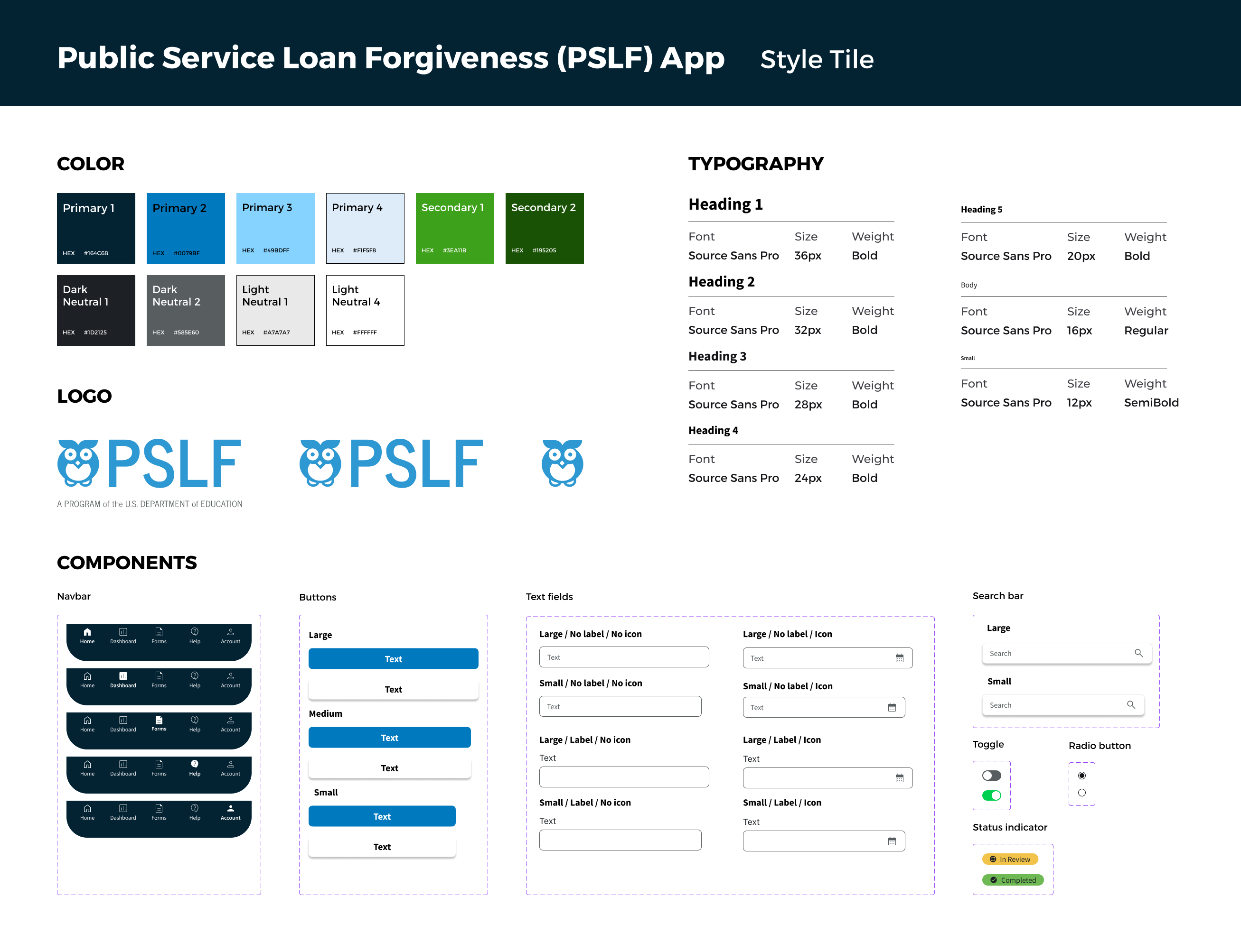
I used elements of the Federal Student Aid website to develop the branding for the PSLF app to maintain consistency with the U.S. Department of Education's branding.
- Color palette. I chose shades of blue and green from the Federal Student Aid branding to create a bright and inviting color palette for the PSLF app.
- Typography. I chose Source Sans Pro from the U.S. Web Design System as the only typeface in my design. An open-source sans serif typeface designed for legibility, Source Sans Pro works well in headers and body text.
- Logo. I used an owl icon used in the Federal Student Aid branding to create a simple and fun logo for the PSLF app.
Wireframes
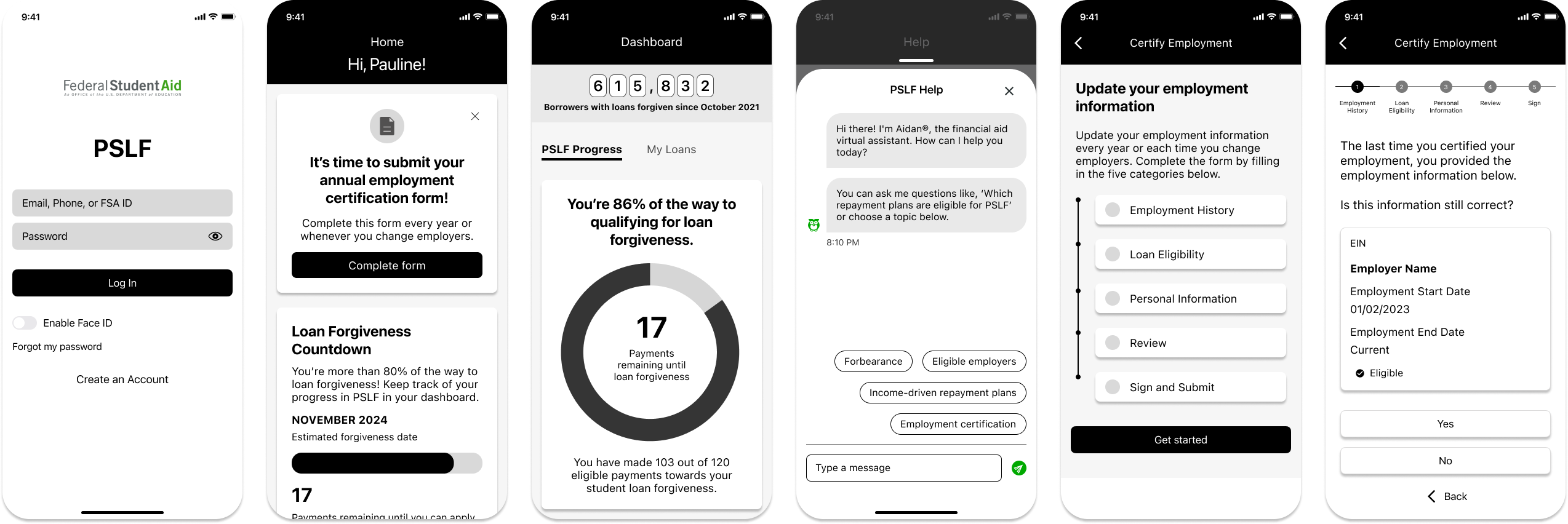
I developed several iterations of low- and mid-fidelity wireframes, leading to the design of my high-fidelity prototype that I would test with users.
Test
Usability testing
I tested my high-fidelity prototype with users through remote usability tests. The usability tests focused on:
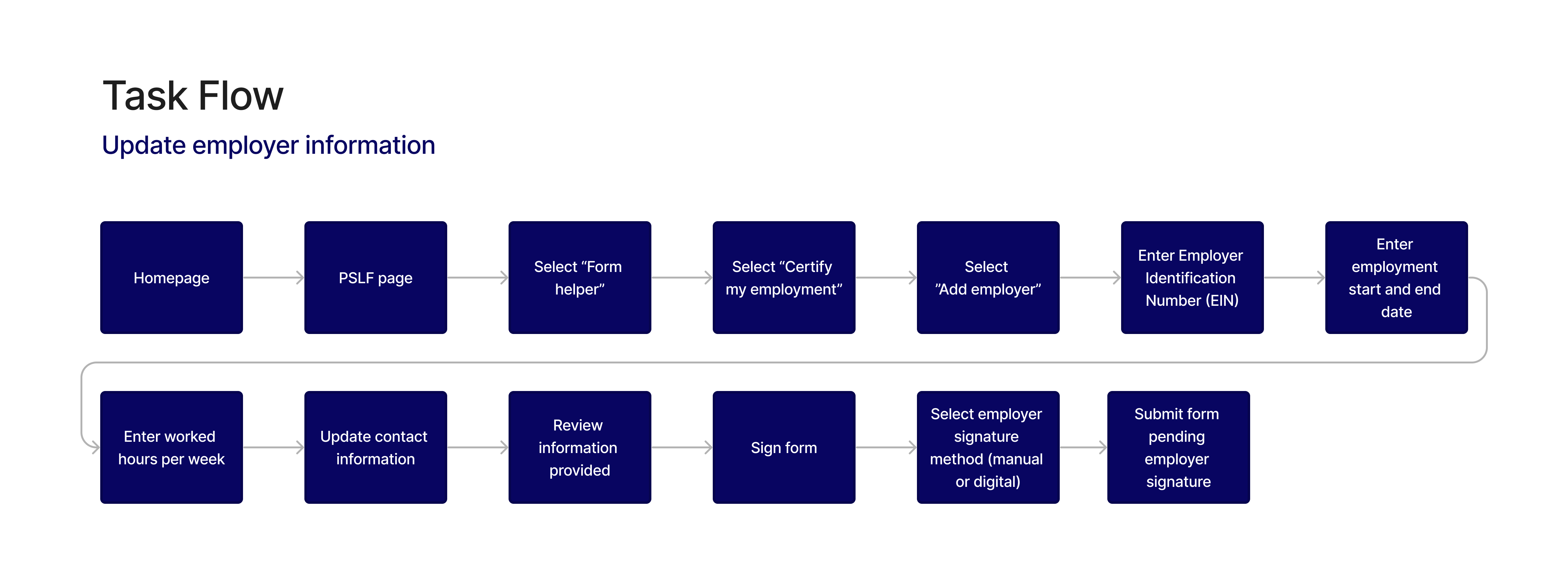
- Can users complete the employment certification process through the app?
- What challenges do users encounter when certifying their employment?
- Can users answer questions about their progress in the PSLF program?
- Are there other questions that users have about their progress in PSLF that are not addressed in the app?
- Can users answer questions about their loans using the chat tool?
- How satisfied are users with the experience of using the PSLF app?
Takeaways
What worked well
- Users completed all tasks successfully. All participants were able to complete the tasks and rated them to be easy (less than 2 on a scale of 1-5).
- Chat tool helps users answer questions quickly. All participants were able to answer a question about student loans in less than a minute using the chat tool.
- Clear design that guides the user through multi-step forms. 80% of participants commented on the clear presentation of the multi-step form (overview, progress bar, clear labels) that helped them know what to expect from the process.
- Bring together all PSLF resources in one place. 40% of participants commented that the app included everything they would need to manage their PSLF participation.
What could be improved
- Presentation of information in the dashboard could be clearer. 80% of participant noted that the dashboard should make the most important information stand out more.
- Chat tool should be more prominent. 60% of participants commented that the chat tool should be easier for users to find quickly from the home screen.
- Confusion over distinction between buttons and some cards. 60% of participants noted that the distinction between buttons and some cards could be clearer, so it is easy for users to know where to click.
- Clearer signal that process was completed. 40% of participants said the design should make it clearer to users when they have completed a multi-step form.
- Shorter and to-the-point text. 20% of participants suggested that the text in the multi-step form should be made shorter and clearer to make sure users don’t skip the instructions.
Revisions
Problem #1
Need clearer presentation of information in the loan dashboard.
Solution
- Made progress bar showing the loan amount paid and amount remaining the first item in the dashboard.
- Added more meaningful headers and clearer labels to data visualizations.
- Added payment amount information to the loan details card.

Before revisions

After revisions
Problem #2
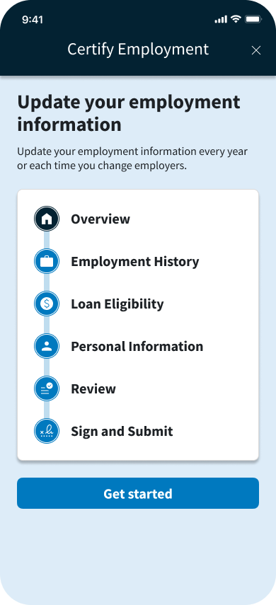
Confusion over distinction between buttons and some cards.
Solution
- Added an "Overview" item in the process overview to orient users to where they are in the process.
- Combined multiple cards into a single card to reduce confusion between cards and buttons.
- Added icons to each item for clarity and visual interest.
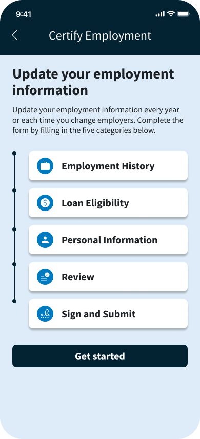
Before revisions
After revisions
Problem #3
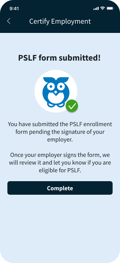
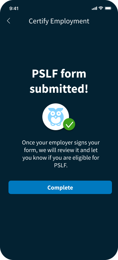
Clearer signal that employment certification process was completed successfully.
Solution
- Changed the background color from light blue to dark blue to distinguish the completion screen from the multi-step progress screens.
- Increased font size announcing "PSLF form submitted!"
- Shortened text for clarity.
Before revisions
After revisions
Final design
After working through several iterations of my design and testing a prototype with potential users, I developed the final prototype of the PSLF mobile app.
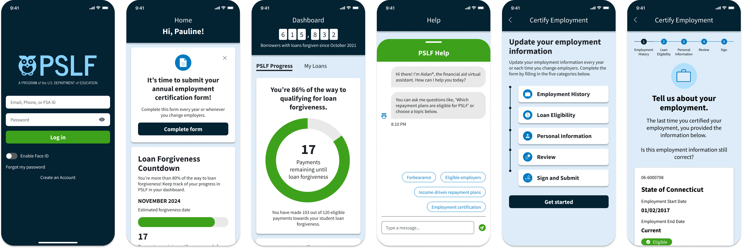
Easy access to everything users need to manage their PSLF participation
- Accounts are linked with Federal Student Aid accounts, providing easy access to loan information.
- Home screen is personalized to every user, providing reminders and updates on the user's PSLF participation.
- From the home screen, users can easily access PSLF forms, track their progress, or get help—managing all aspects of their participation in the PSLF program in one app.

Clear dashboard that lets users track their progress in real time
- The dashboard gives users insight into their PSLF participation and their loans more generally.
- The PSLF Progress dashboard lets users quickly see their progress towards loan forgiveness and tells users the number of borrowers who have had their loans forgiven to motivate program participants.

Access to resources and live support
- The Help screen allows users to search for more information and browse support articles.
- Users can also use the chat tool when they need live support.

Next steps
- Test the app with new users to determine the effectiveness of the revisions.
- Build wireframes for additional processes, like the updating an Income Driven Repayment (IDR) Plan, signing up for PSLF, and applying for loan forgiveness.
Lessons learned
- Because loan information can be dry and complex, I focused on breaking up long processes into short, manageable chunks and guiding the users through the process.
- In the user interviews, I asked what information people wanted to see about their loans and translated that to the data visualizations and information highlighted in the dashboard. I focused on presenting insights that were of greatest interest to users and presenting the data simply and clearly.
See more of my work
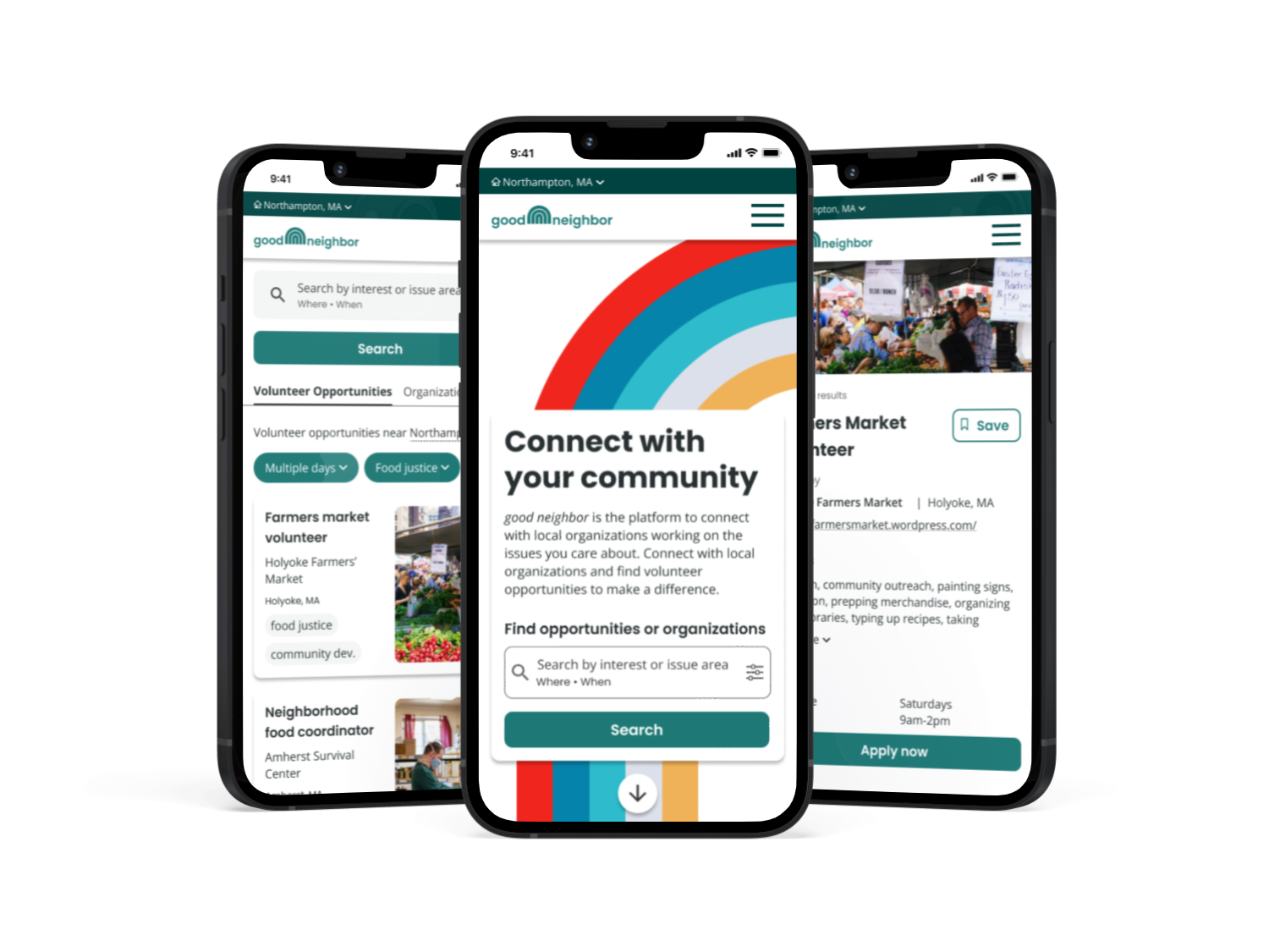
good neighborResponsive website design
