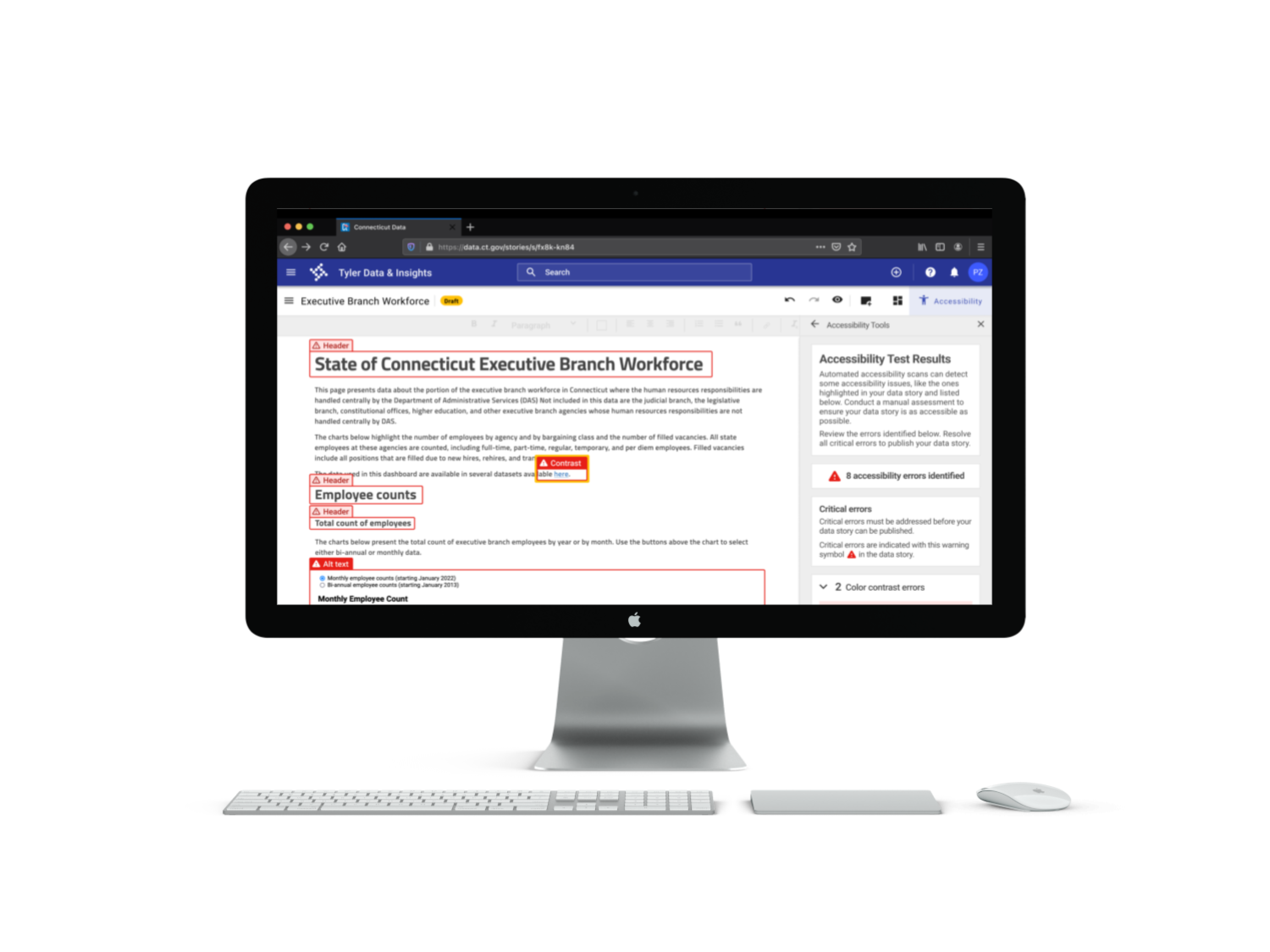
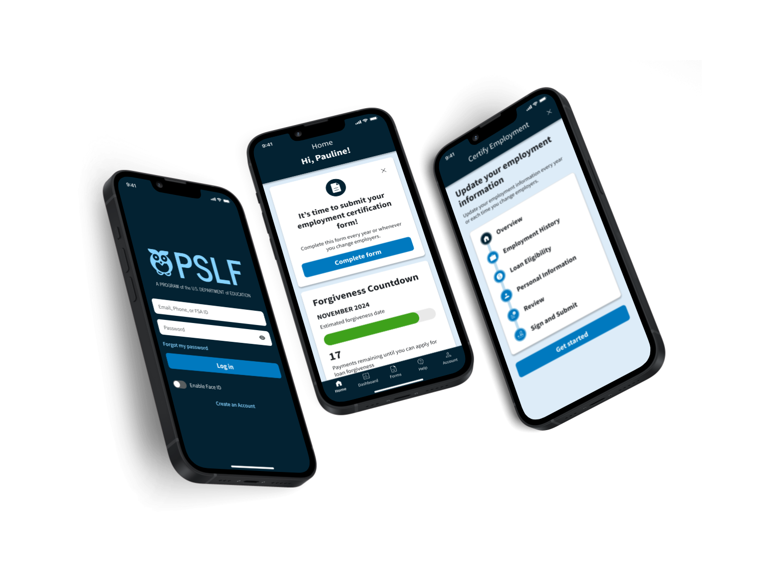
Project overview
Background
The Pioneer Valley Transit Authority (PVTA) is the largest regional transit authority in Massachusetts, providing vital public transportation services for the residents of western Massachusetts. Information about how to use public transit should be easy to access and understand to better serve current riders and to encourage new riders to use the bus.
Problem
The current PVTA website includes information on a range of topics, including information about PVTA governance, administration, and business opportunities. However, in the current design of the website, it can be difficult for users to find the information they need to plan a trip with PVTA.
Goal
To redesign the PVTA website to make it easier for users to get the information they need to use the bus.
Solution
I redesigned the PVTA homepage and other pages essential to the trip planning process. I focused on centering the needs of existing and potential users in planning a trip with PVTA.
Timeline
April - June 2023
My role
End-to-end UX/UI designer. Responsible for user research, prototyping, and testing
Tools used
Figma, Miro, Optimal Workshop
Design process
Empathize
Research the needs of users and understand their needs, goals, and pain points
Empathize
User interviews
I conducted six interviews with PVTA users, potential PVTA users, and users of other public transit systems. The findings listed below highlight the challenges, needs, and tools used by interview participants.
Challenges
- Uncertainty and lack of information. Uncertainty about when the bus will arrive makes it difficult to plan a trip accurately.
- Scheduling. Limited service hours make relying on the bus a challenge.
- Limited infrastructure and routes. A lack of amenities at bus stops and limited routes in rural areas are challenges for users.
Information needed to use public transit
- Timing. Users need to know when the bus will arrive, how long the trip will last, if there are any delays, and the hours of operation.
- Routes. Users need to know which bus goes to their destination, if they will need to make a transfer, and how close the bus stop is to their final destination.
- Logistics. Users need to know how much the fare costs and how to pay. They also need to know the mechanics of riding the bus.
Tools used to travel with public transit
- Google Maps app. Many users rely on Google Maps as their primary tool for planning trips on public transit.
- Transit app. The Transit app is specifically for public transit navigation and includes accurate information on timing, including delays and schedule changes.
- Transit authority websites. Users do not generally use public transit websites for navigation. They are more likely to use it for finding information about schedules, maps, and fares.
User personas
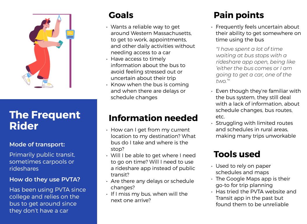
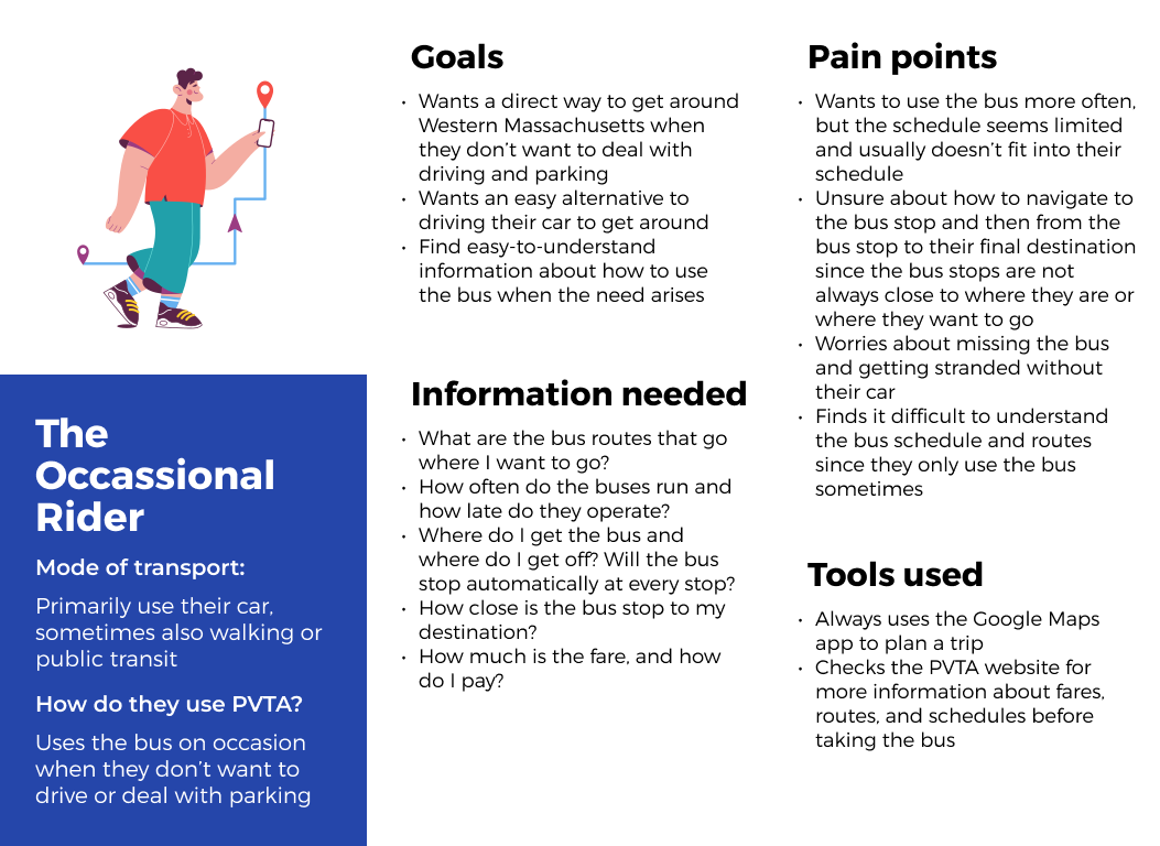
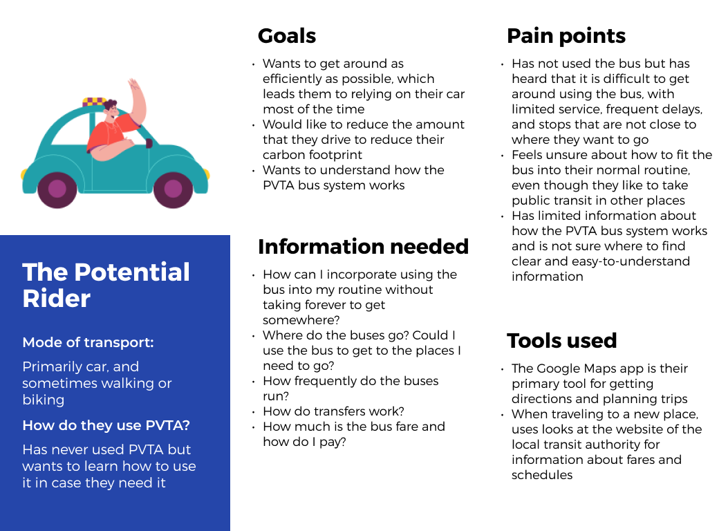
Based on the interview findings, I developed three user personas to guide the PVTA website redesign: the frequent rider, the occasional rider, and the potential rider.
Card sort & site map
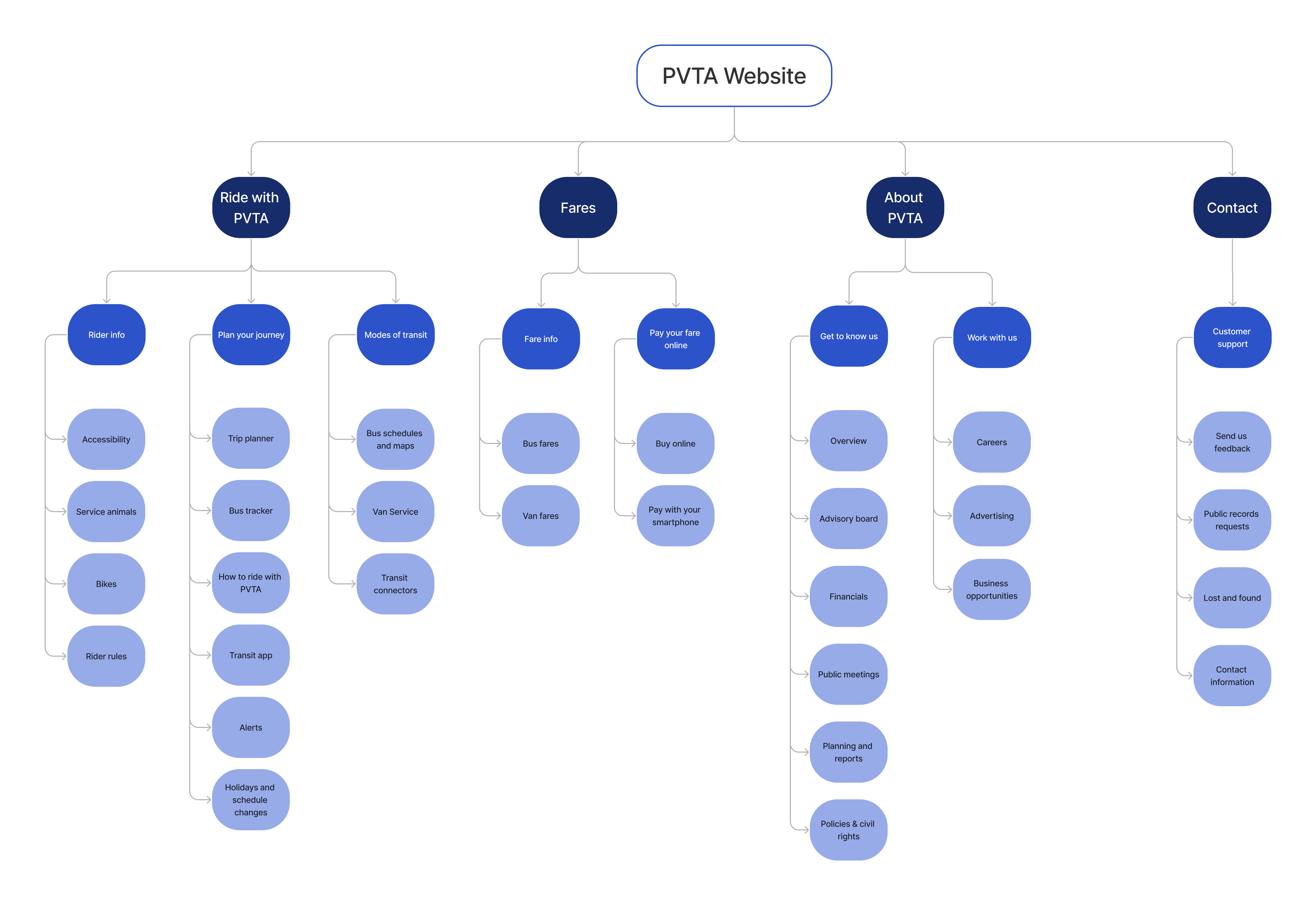
I conducted a moderated open card sort to understand the mental models of potential users and how they group information, and to inform the information architecture of the redesigned PVTA website. The results of the card sort informed the development of a new site map.
Takeaways
- Key trip planning information. Most participants grouped together information related to planning a trip using PVTA, including the trip planner feature, schedules, and maps. One participant labeled this group “most immediate uses” signaling that trip planning information is their top priority when visiting the site.
- Opportunities for streamlining information. Some participants commented that some cards seemed redundant, especially the cards about fares and alerts. This indicated an opportunity to streamline the existing information architecture of the website.
Comparative analysis
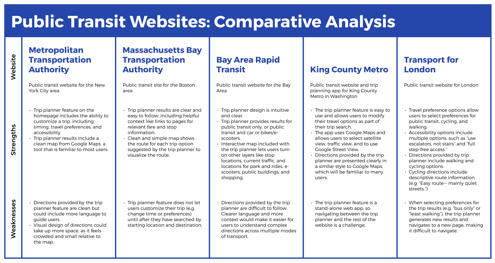
I reviewed the websites of six other public transit organizations to identify best practices. I focused on the trip planning experience through public transit websites.
Takeaways
The best practices identified in the comparative analysis included:
- Clear information architecture organized around users’ goals
- Visual hierarchy that guides users to the information that they need
- Presentation of trip planning results uses styles familiar to users
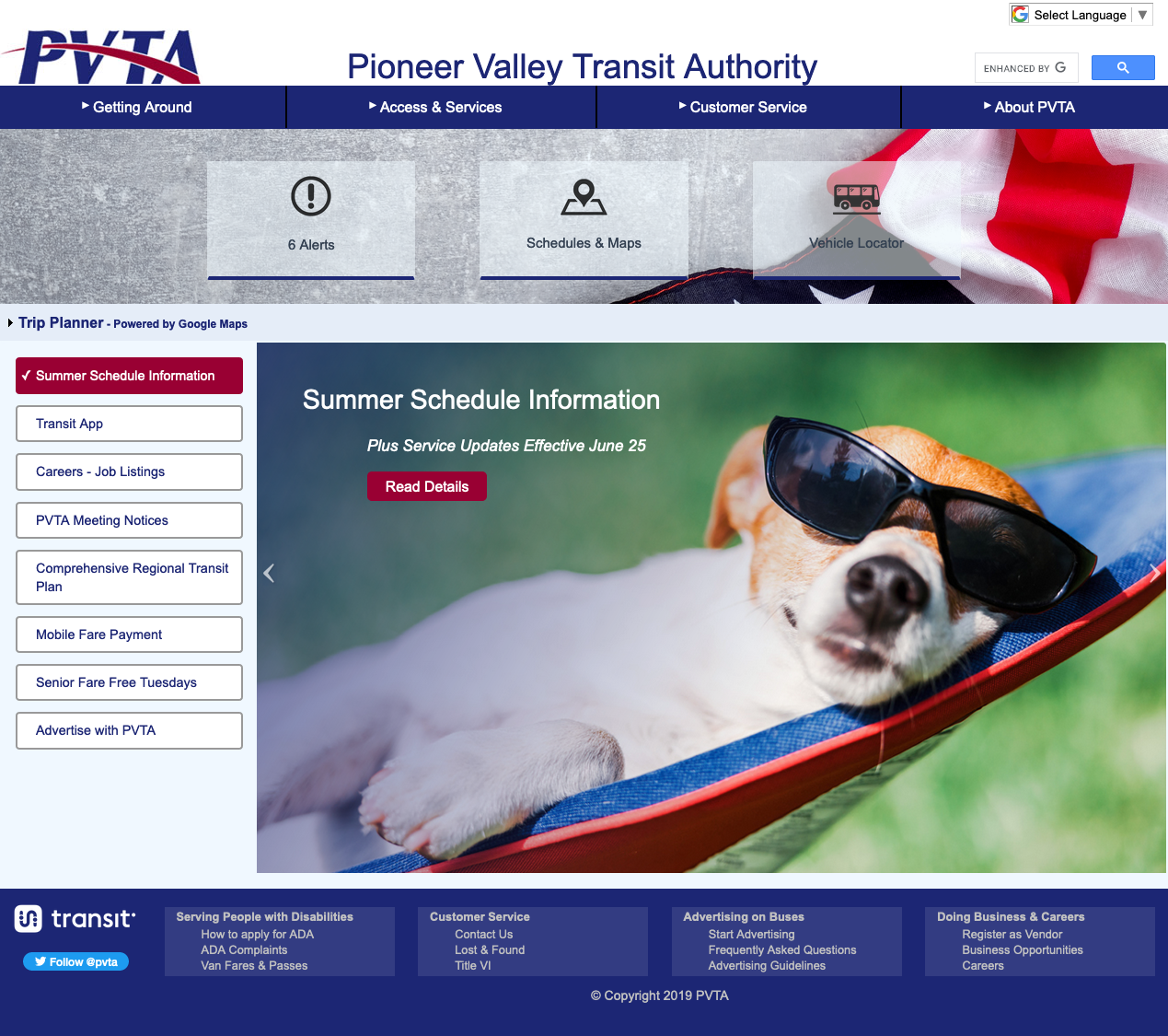
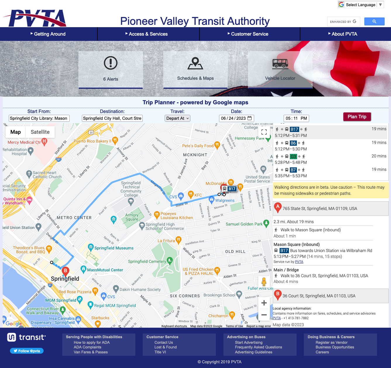
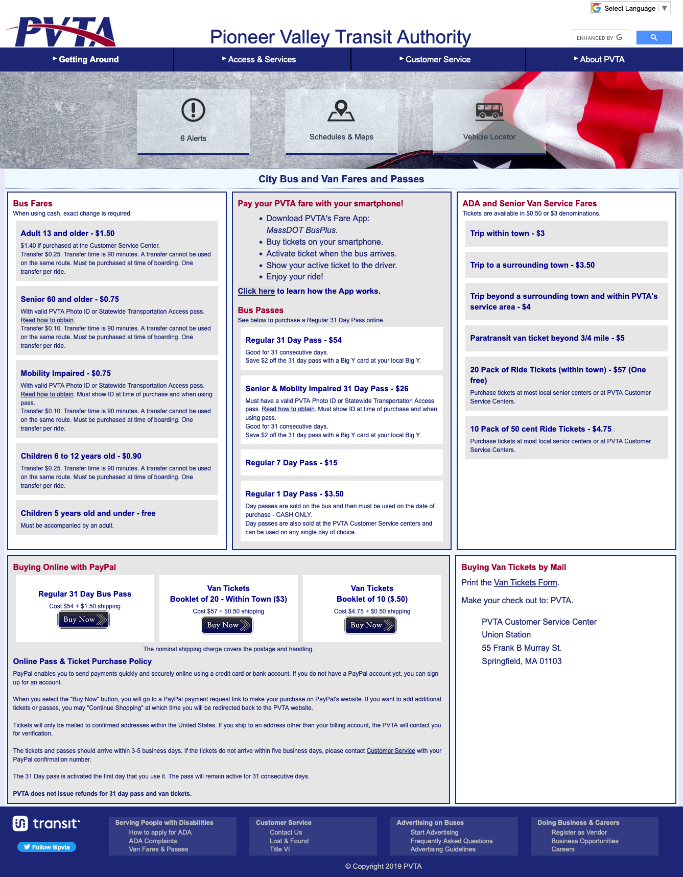
Review of current PVTA website
I reviewed the current PVTA website to better understand its content and to identify areas for improvement.
Takeaways
- Lack of clear visual hierarchy and text-heavy content. The lack of visual hierarchy makes it difficult for users to navigate the informationally dense content. Some key features (CTAs and the trip planner feature) are relatively small and easy to miss.
- Flat content hierarchy. Most of the website’s content is accessible through the drop-down menu in the global navigation. This helps with discoverability, but unclear labels and overlapping categories make finding information difficult.
- Overlapping categories in content and navigation. Categories like “Schedules & Maps” and “Maps, Directions, & Links” or “How to Ride” and “Traveling on Buses” overlap and make it difficult to know where to find information.
Problem statement:
PVTA riders need an easy way to find information about the bus so they can feel confident when planning a trip using public transit.
Ideate
Feature prioritization
I brainstormed a list of features to include in the redesigned PVTA website, prioritizing them based on whether they were essential, would be nice to have, or could come later.
Must-have features
Trip planner tool. Include directions for whole journey, including to and from the bus stop.
Bus stop information. Including when the stop is unmarked so people know what the stop looks like and where to stand.
Schedule changes and alerts. Current alerts and planned schedule changes.
Essential info for how to ride the bus. Bus route maps, schedules, fare information and how to pay, etc.
- Link to download Transit app and MassDOT Bus Plus app. Easy access to relevant apps for trip planning and payment.
Nice-to-have features
Trip planner tool integration with other modes of transport. Include information on ValleyBike, park and rides, Lyft, Uber, etc.
Form for users to provide feedback and make requests about PVTA. Feedback submission form and highlighting progress on making changes based on public feedback.
Feature on the trip planner tool that alerts users when their stop is coming up. Allow users to follow their real-time progress on a bus and get an alert when their stop is coming up.
Real-time bus tracking information. Live bus information to show users when the bus will arrive.
Prototype
Visual design elements
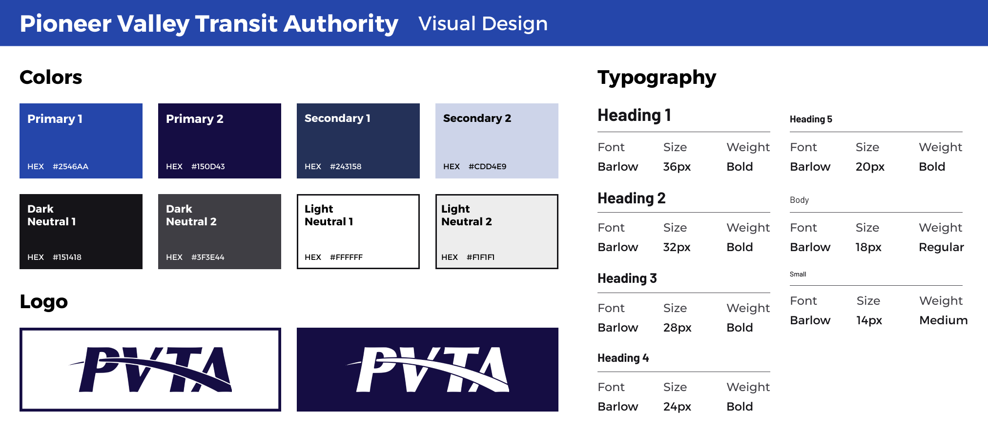
I updated the existing PVTA branding with a more modern and cohesive look and feel to evoke feelings of reliability and trustworthiness.
- Color palette. I chose various shades of blue for color palette. I opted for a monochromatic look to keep the design cohesive and clean.
- Typography. I chose Barlow as the only typeface in my design. Its many weights and styles made it a versatile option for PVTA's content-dense website. Barlow was inspired by highway and transit signage in California, which also fits well with for a public transit website.
- Logo. For the PVTA logo, I kept the existing logo for consistency with the wider PVTA branding on buses and signage. I simplified the logo, creating a single-color version rather than the original two-tone red and blue logo.
Wireframes
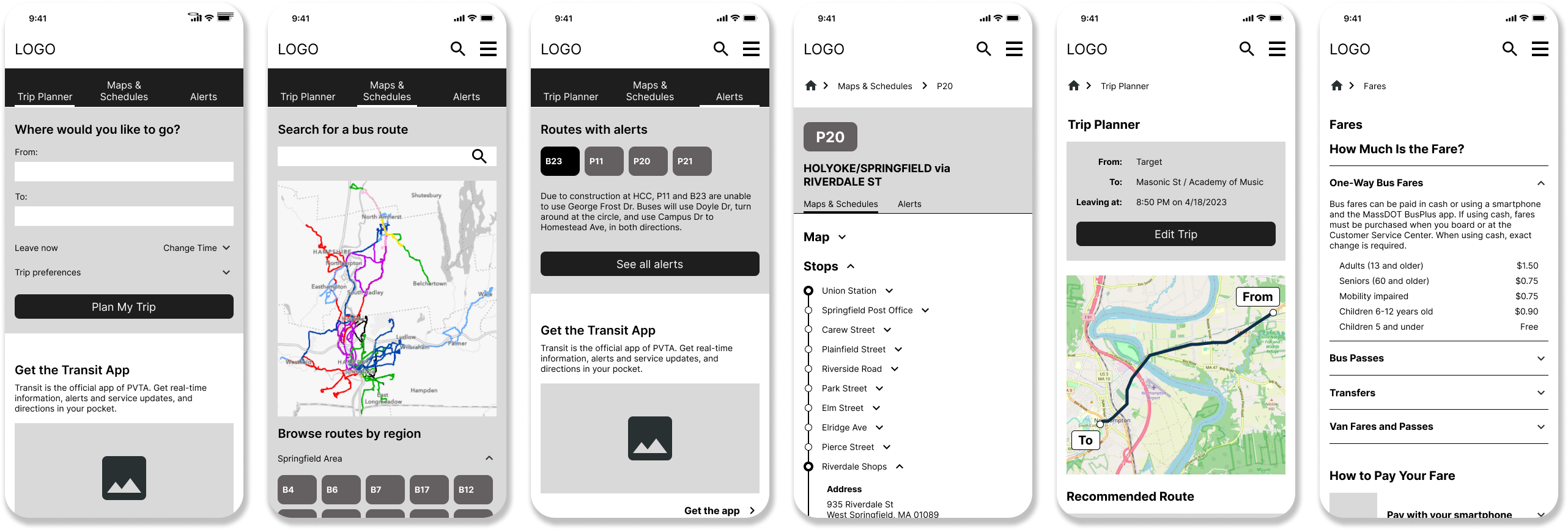
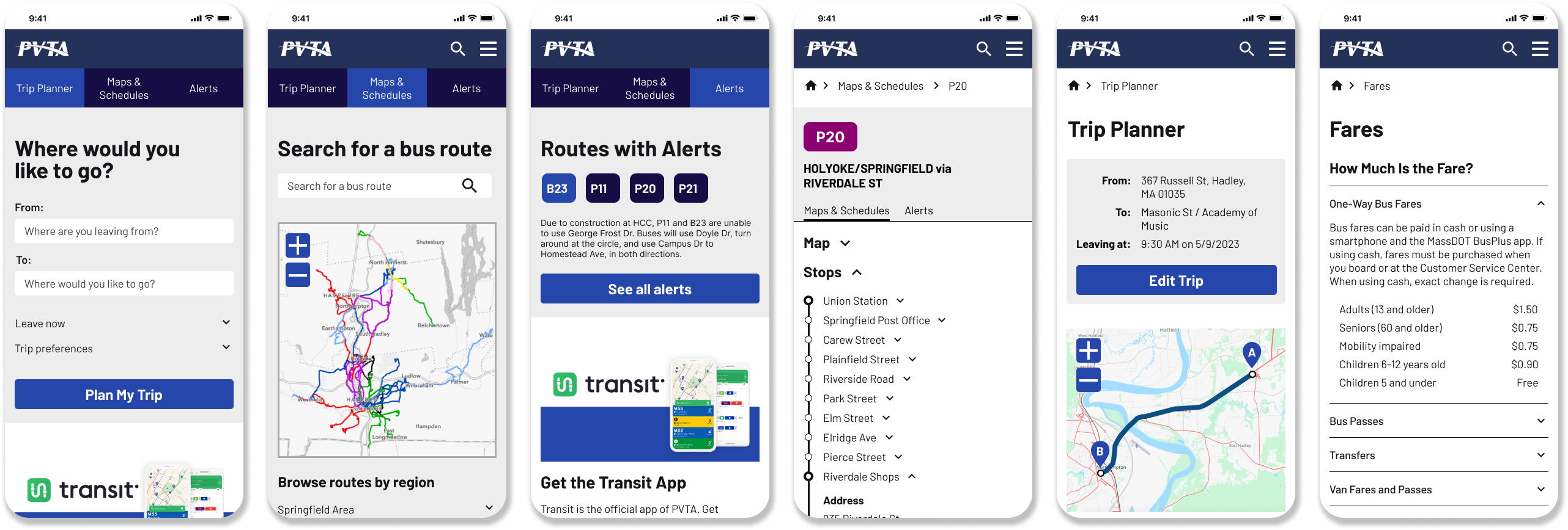
I developed several iterations of low- and mid-fidelity wireframes, leading to the design of my high-fidelity prototype that I would test with users.
Test
Usability testing
I tested my high-fidelity prototype with users through remote usability tests. The usability tests focused on:
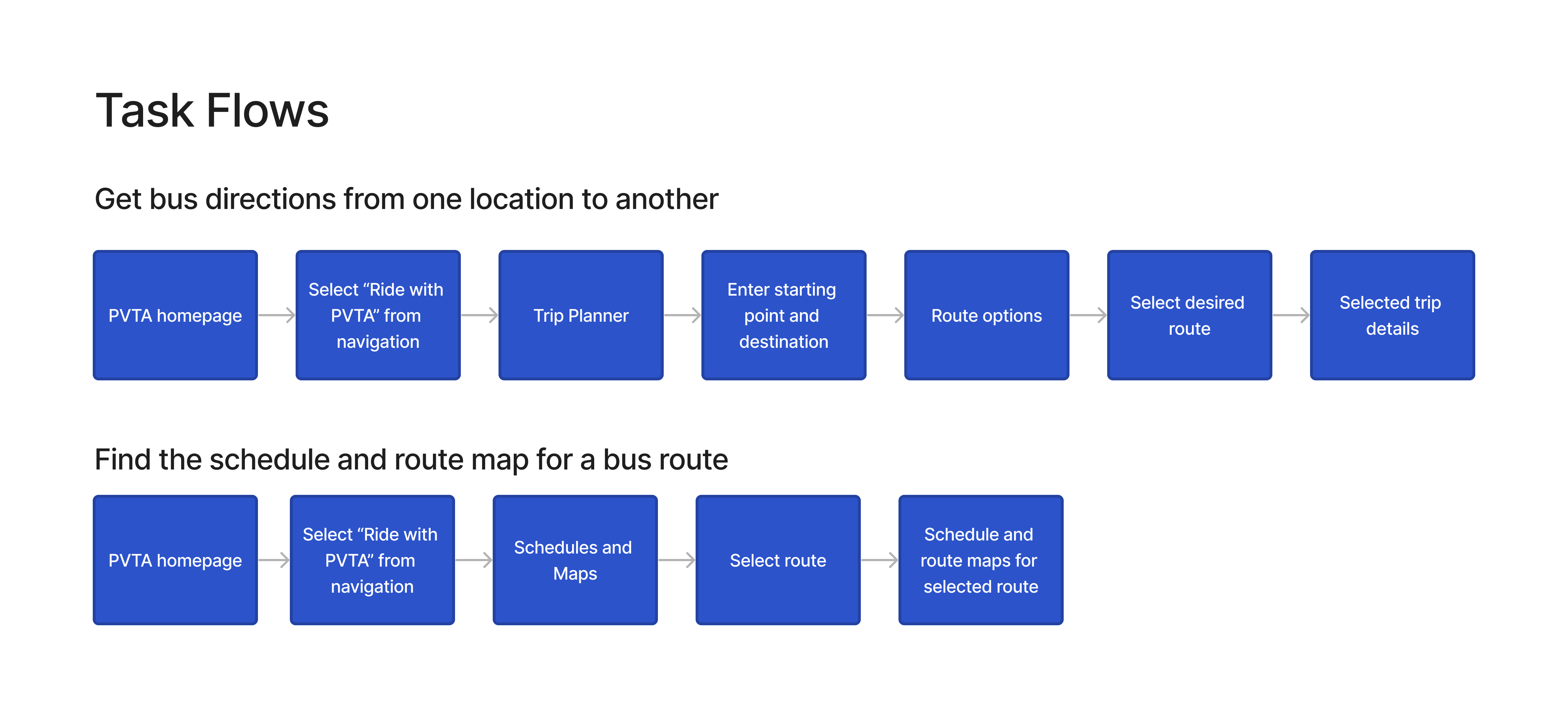
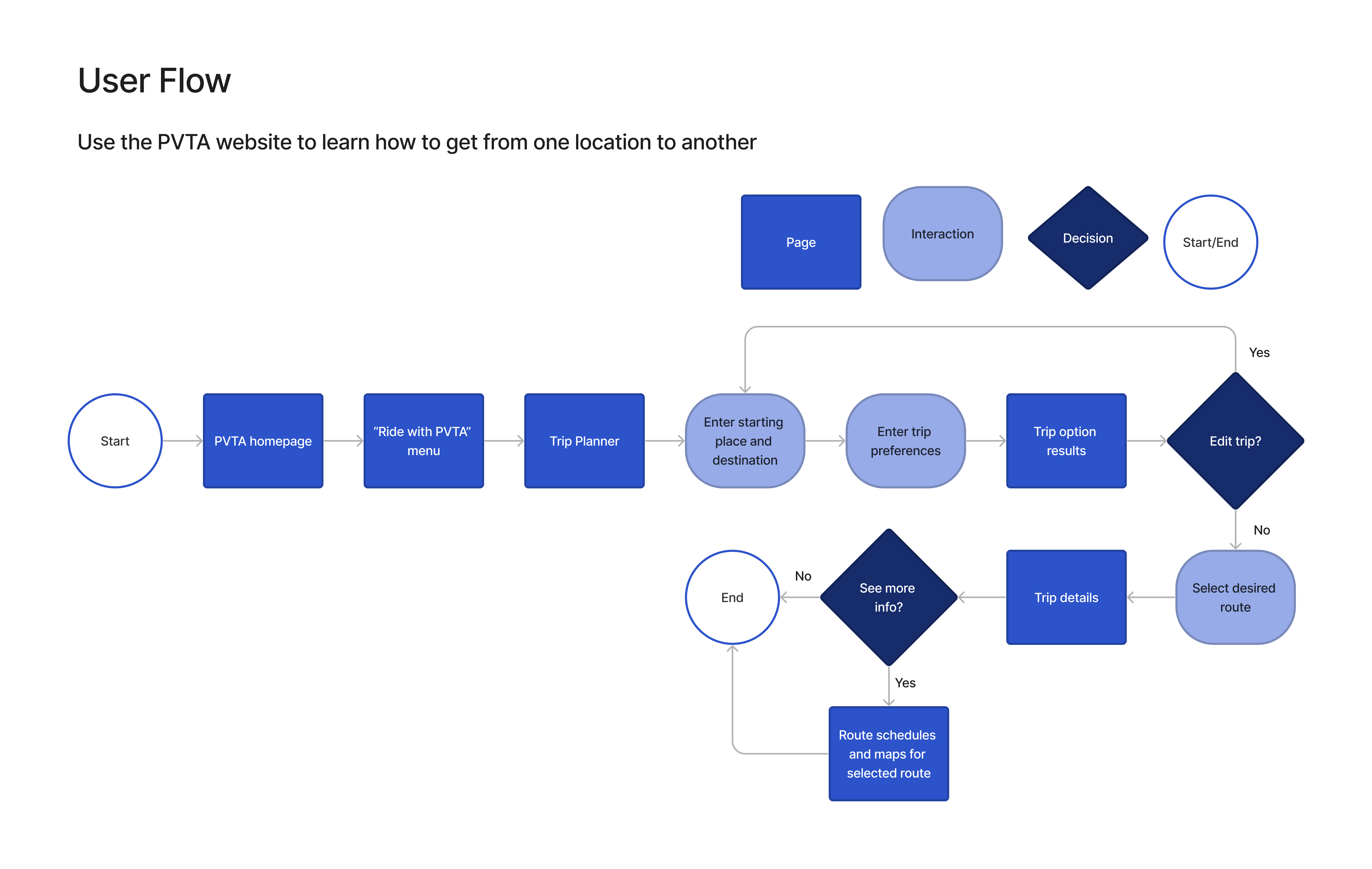
- Can users use the trip planner tool to get directions from one place to another?
- Can users find information about a specific bus route?
- Can users easily find fare information?
- What challenges do users encounter when using the trip planner feature?
- How satisfied are users with the experience of using the trip planner?
Takeaways
What worked well
- Trip planner feature functionality. All participants noted that the trip planner feature was easy to use, and they were able to get directions from one location to another.
- Prominence of fare information. 80% of participants noted the usefulness of highlighting the fare information prominently on the homepage.
- Context provided in the directions. 40% participants commented that the language used in the directions made it easy to know what to expect (e.g. language like “next bus arrives at…”)
- Ability to use current location in trip planner. 40% of participants noted that they liked the ability to use their current location when inputting a starting place in the trip planner tool.
- Inclusion of street view in directions. 20% of participants commented that they liked the ability to see a street view of the bus stop in the detailed bus information.
What could be improved
- Lack of clarity about what PVTA is. 60% of participants did not understand what PVTA stood for or what kind of services it provided.
- Difficulty scanning fare information page because some key information needs to be clicked to expand. 60% of participants commented that the fare information page would be easier to scan if key fare information did not need to be clicked and expanded to view.
- Difficulty finding the detailed bus information in the navigation menu. 40% of participants struggled to find the detailed bus information using the navigation menu, noting that they thought it should be under the “Bus” menu item and not “Schedule and Maps”.
- Preference for highlighting directions before showing a map in trip planner results. 40% of participants noted that they would expect to see the suggested routes before the map of the route in the trip planner results screen.
Revisions
Problem #1
Lack of clarity about what PVTA is
Solution
- Added a banner image and other imagery featuring PVTA buses to help make it clear to users that the website is about a bus system.
- Created a new “About PVTA” section on the homepage.

Before revisions

After revisions
Problem #2
Difficulty finding information on the fare information page
Solution
- Organized price information into tables.
- Moved information about how to pay your fare to the front fare information screen so users no longer had to click to reveal the information.

Before revisions

After revisions
Problem #3
Need to make directions provided by the trip planner tool easier to follow
Solution
- Added clear language to guide users through the direction.
- Added more context to the directions, including links to the bus stop information page, links to fare information, and schedules and maps.
- Added "street view" images to help orient the users.

Before revisions

After revisions
Final design
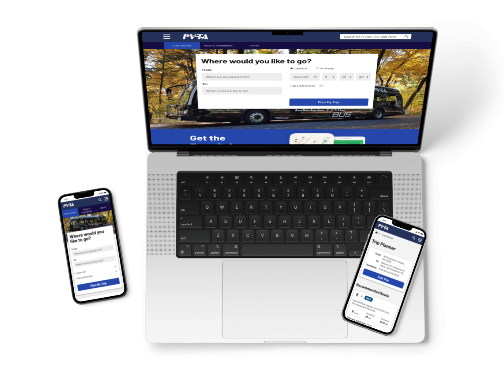
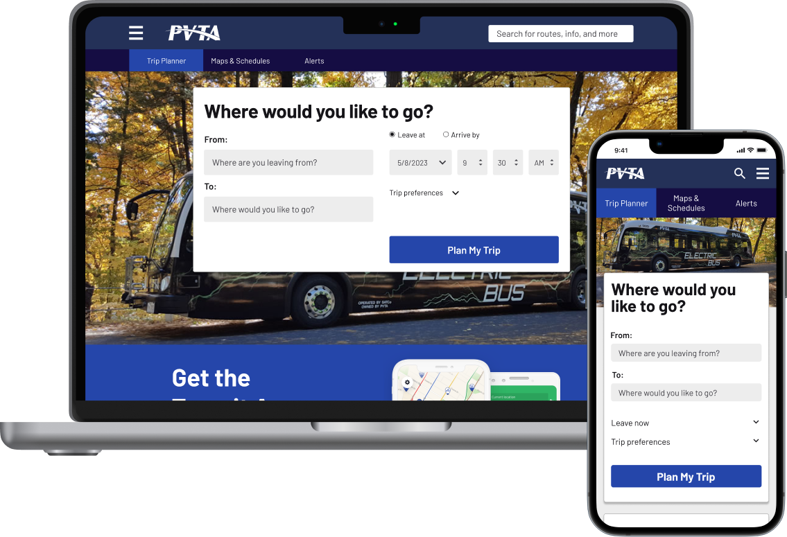
After working through several iterations of my design and testing a prototype with potential users, I developed the final mobile and desktop prototype for the redesigned PVTA website.
Simple visual design, allowing users to quickly find the information they need
- From the homepage, users can quickly access between key trip planning information.
- Inclusion of high-priority key information on the homepage.
- Cohesive visual design across the site.


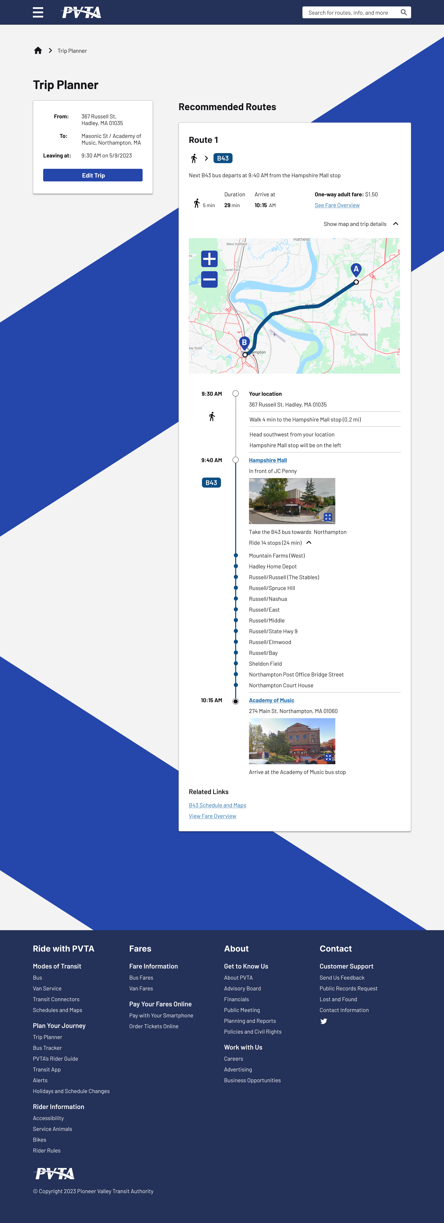
Clear directions in a familiar format but with added context
- The trip planner tool presents uses a familiar format, inspired by Google Maps, to help users navigate easily.
- Directions include contextual information (e.g. fare information, street view imagery, etc.) giving a fuller picture of the trip.

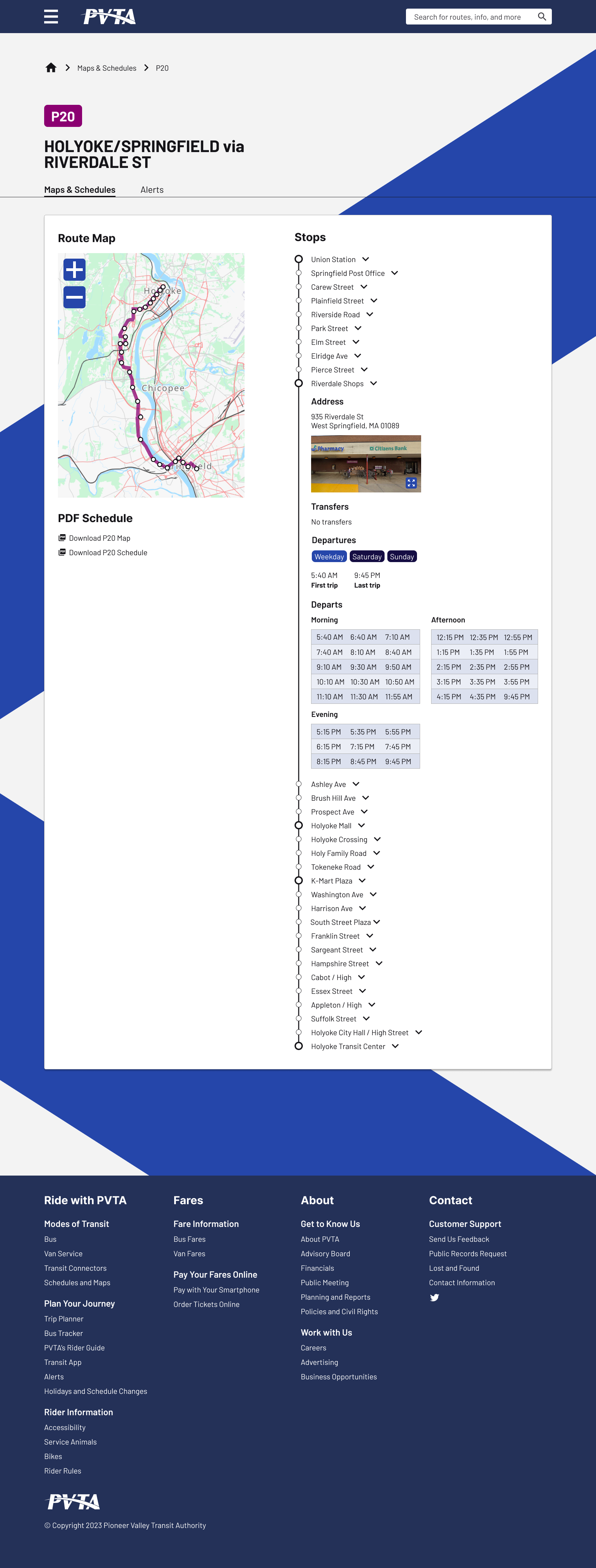
Streamlined route information
- Users can access schedule information, maps, and alerts for all routes directly on the website without needing to download PDFs or search across multiple pages.
- Detailed bus stop information is provided for each stop to help users plan their trips.

Next steps
- Test the website with new users to determine the effectiveness of the revisions.
- Develop additional web maps of bus routes and the entire PVTA system.
- Develop wireframes for the remaining pages.
Lessons learned
- Because the PVTA website is informationally very dense, in the redesign I focused on making detailed information digestible to users through visual design (e.g. clear visual hierarchy, revised content, etc.) and by organizing the content according to specific user needs.
- I thought through the role of the public transit website in the landscape of popular trip planning tools like Google Maps. I realized that the trip planning functionality on the PVTA website should not try to replicate these popular tools, but instead should focus on what value it could add for users.
- People experience many challenges while taking public transit (e.g. limited routes and hours, accessibility challenges, unclear or nonexistent signage at stops, etc.). Many of these challenges can not be addressed through a website redesign. However, the design of the website is key in providing access to information that could reduce uncertainty and a lack of information experienced by users of public transit.
See more of my work
good neighborResponsive website design
